| start_port | men | women | children |
|---|---|---|---|
| Bristol | 0.38397 | 0.23207 | 0.38397 |
| Bristol | 0.39200 | 0.25600 | 0.35200 |
| Bristol | 0.48780 | 0.17480 | 0.33740 |
| Bristol | 0.26943 | 0.22280 | 0.50777 |
| Bristol | 0.14881 | 0.13095 | 0.72024 |
| Bristol | 0.47737 | 0.18519 | 0.33745 |
5 Reshaping data and combining plots
5.1 Intended learning outcomes
By the end of this chapter you will be able to:
- Reshape data from wide to long with
pivot_longer() - Plot grouped distributions using one mapping per categorical column rather than one column per category
- Order categorical axes deliberately with
factor()orfct_relevel() - Combine multiple plots into a single figure with the
patchworkpackage
5.2 Functions used
- tidyr:
pivot_longer(),drop_na() - forcats:
fct_relevel() - ggplot2:
geom_boxplot() - patchwork:
+,/,plot_layout(),plot_annotation()
5.3 From wide to long
The dataset has three columns recording the demographic make-up of each voyage. men, women and children are each a proportion of the people embarked. Most voyages in the database do not record this breakdown, so these three columns are missing for the great majority of rows. Before reshaping, we drop the voyages with no demographic data using drop_na(), which removes any row that is missing a value in one of the named columns.
This is the wide form. Each demographic category has its own column. To plot them together we need the long form, where one column holds the category and another holds the value.
pivot_longer() does the conversion. We tell it which columns to gather (cols), the name of the new column that will hold the original column names (names_to) and the name of the new column that will hold the values (values_to).
| start_port | demographic | proportion |
|---|---|---|
| Bristol | men | 0.38397 |
| Bristol | women | 0.23207 |
| Bristol | children | 0.38397 |
| Bristol | men | 0.39200 |
| Bristol | women | 0.25600 |
| Bristol | children | 0.35200 |
Each voyage now appears three times, once per demographic category. The column is called demographic because it holds the categories man, woman and child. The values are proportions of the people embarked.
Note
The demographic figures describe only the voyages that recorded them, a minority of the total. The original column names men, women and children are inherited from the source database. In the reshaped data, the column demographic holds those labels as values.
5.4 Ordering categorical axes
By default, ggplot will plot demographic in alphabetical order, which puts children first. We probably want men, women, children or the other way around. fct_relevel() from forcats is the easiest way.
5.5 Grouped boxplots
We can now show the distribution of the demographic proportions, broken down by port of origin, all on one plot.
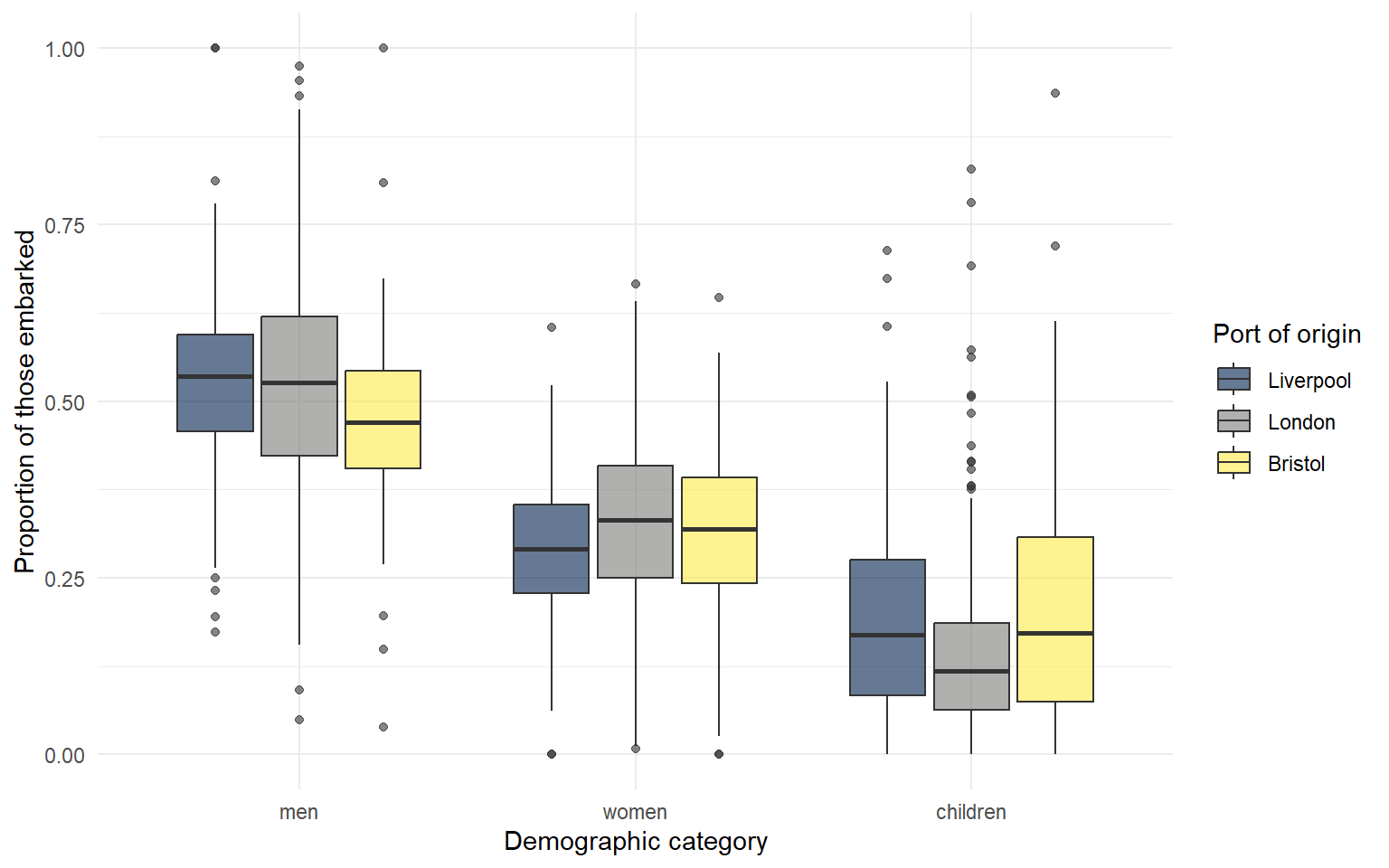
Men make up the majority of those embarked on every type of voyage, but the proportion of women and children varies markedly by port.
TipActivity
Change the value of alpha and observe what happens. Try alpha = 0.2 and alpha = 1.
5.6 Piping straight into ggplot
You can combine filter() and ggplot() in a single pipe rather than creating an intermediate object. The example below takes the long-format data, filters to voyages that disembarked in the Americas, and plots the result.
dat_long |>
  filter(outcome == "Slaves disembarked in Americas") |>
  ggplot(aes(x = demographic, y = proportion, fill = demographic)) +
  geom_boxplot(show.legend = FALSE) +
  scale_fill_viridis_d(option = "E") +
  labs(x = NULL,
       y = "Proportion of those embarked",
       title = "Demographic composition of voyages disembarking in the Americas")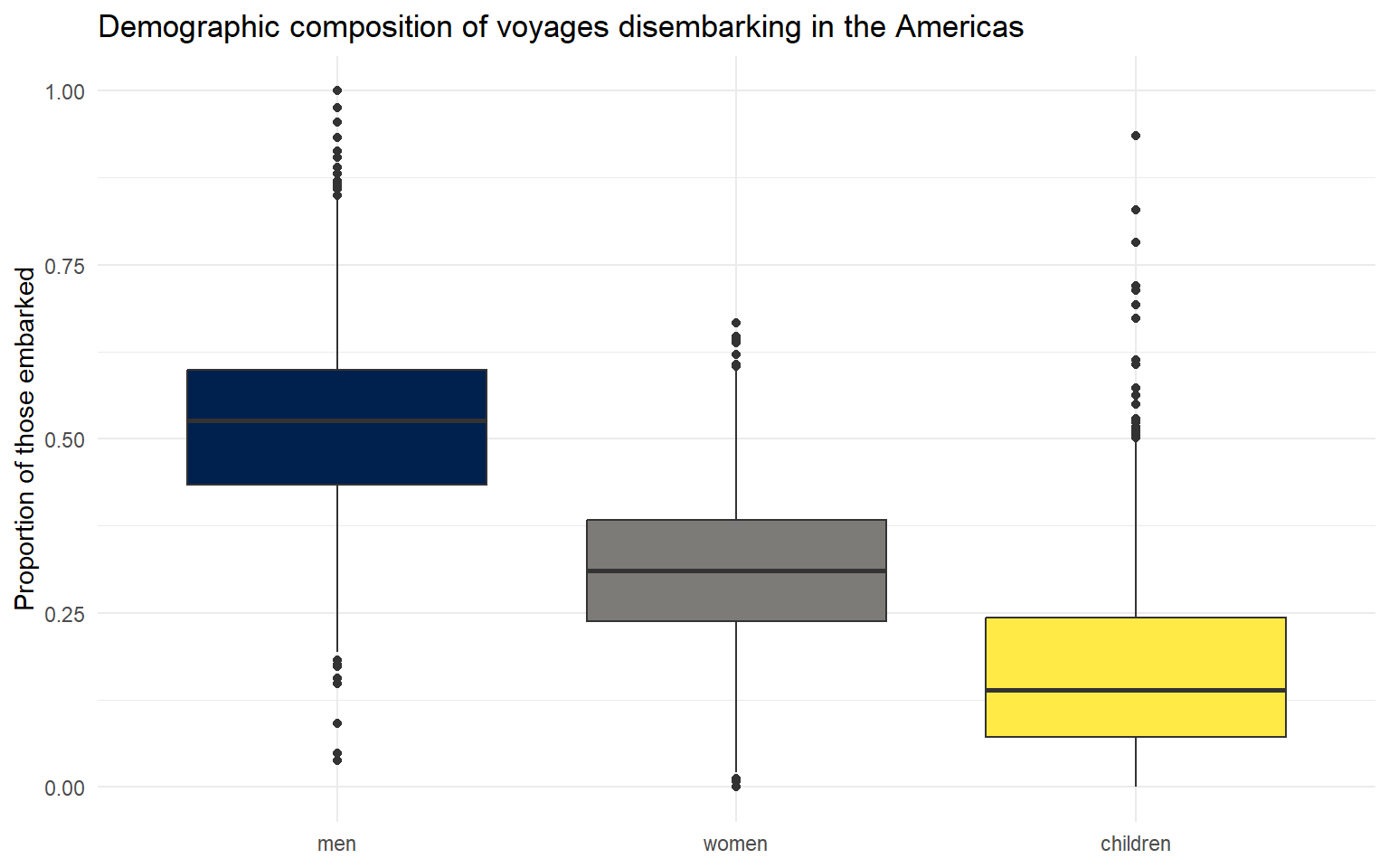
5.7 Combining plots with patchwork
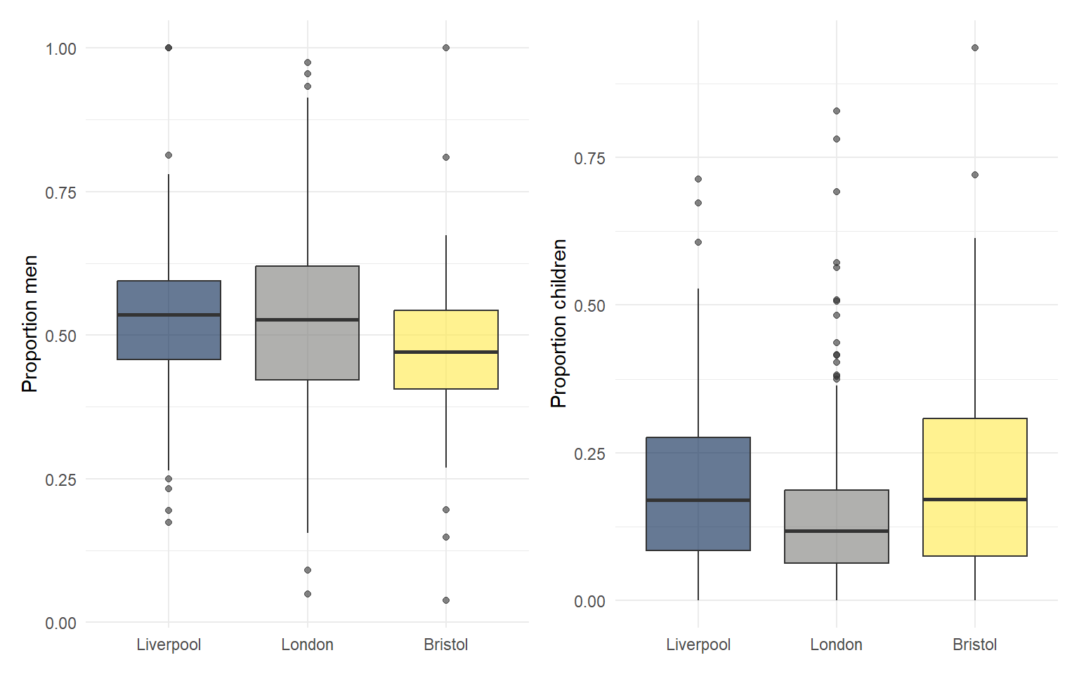
patchwork lets you arrange ggplot objects into multi-panel figures. The syntax is intuitive: + puts plots side by side, / stacks them vertically, and plot_layout() controls the arrangement.
First, save two plots as objects.
men_plot <- dat_long |>
  filter(demographic == "men") |>
  ggplot(aes(start_port, proportion, fill = start_port)) +
  geom_boxplot(show.legend = FALSE, alpha = 0.6) +
  scale_fill_viridis_d(option = "E") +
  labs(x = NULL, y = "Proportion men")

children_plot <- dat_long |>
  filter(demographic == "children") |>
  ggplot(aes(start_port, proportion, fill = start_port)) +
  geom_boxplot(show.legend = FALSE, alpha = 0.6) +
  scale_fill_viridis_d(option = "E") +
  labs(x = NULL, y = "Proportion children")
Then combine them.
Stacked vertically.
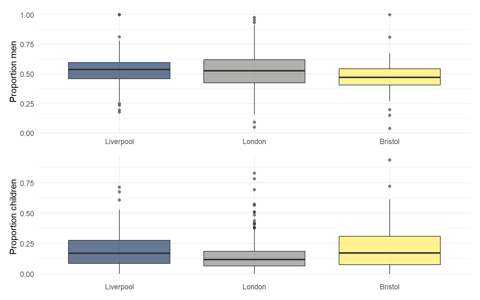
plot_annotation() adds a single overall title across multiple panels.
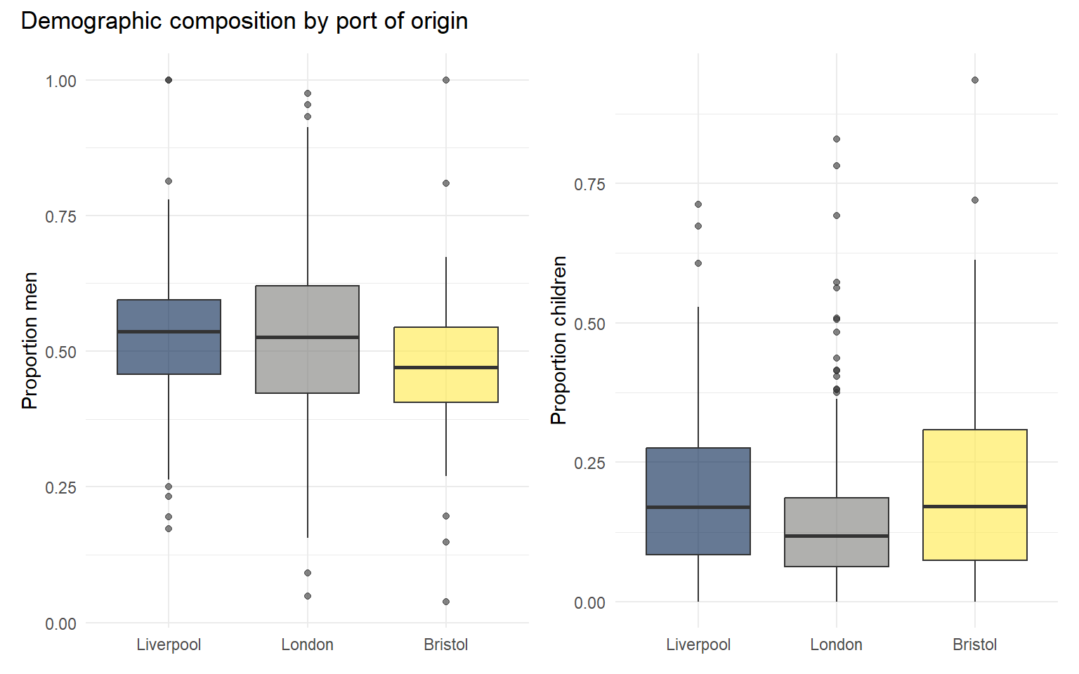
See the patchwork documentation for more elaborate layouts, shared legends and tag_levels for automatic panel labels (A, B, C).
5.8 Activities
TipActivity 1
Build a third plot showing the proportion of women by port, and combine all three plots (men_plot, women_plot, children_plot) in a single row.
NoteSolution
TipActivity 2
Reshape the data back into wide format using pivot_wider(). (Hint: it takes names_from and values_from arguments.)