4 Grouped plots and overplotting
4.1 Intended learning outcomes
By the end of this chapter you will be able to:
- Map a categorical variable to
colourorfillto display three variables on one plot - Distinguish setting an aesthetic inside
aes()from setting it as a fixed value outsideaes() - Split a plot into panels with
facet_wrap()andfacet_grid() - Reduce overplotting with
alphaandgeom_jitter()
4.2 Functions used
- ggplot2:
aes(),geom_point(),geom_jitter(),geom_smooth(),facet_wrap(),facet_grid(),coord_cartesian() -
colourandfillaesthetics
4.3 Adding a third variable with colour
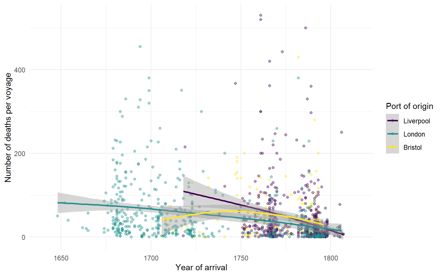
So far our plots have used at most two variables. To show how the number who died on the Middle Passage varied across the period of British involvement, we plot arrival_year against died and map start_port to colour.
TipInside or outside
aes()?
- Inside
aes(): the aesthetic varies with the data.aes(colour = start_port)means each port gets a different colour. - Outside
aes(): the aesthetic is a fixed value.geom_point(colour = "dodgerblue")colours all points the same regardless of port.
The same rule applies to fill, shape, size and linetype.
4.4 Facetting
facet_wrap() splits the plot into one panel per level of a variable. It is an alternative way to display the same three-variable relationship and is often easier to read than overlaid colours.
ggplot(dat_filter, aes(arrival_year, died)) +
  geom_point(aes(colour = start_port), show.legend = FALSE, alpha = 0.4) +
  geom_smooth() +
  scale_colour_viridis_d() +
  facet_wrap(~ start_port, nrow = 3) +
  labs(x = "Year of arrival",
       y = "Number of deaths per voyage",
       title = "Deaths during the Middle Passage, by port of origin") +
  coord_cartesian(xlim = c(1641, 1815))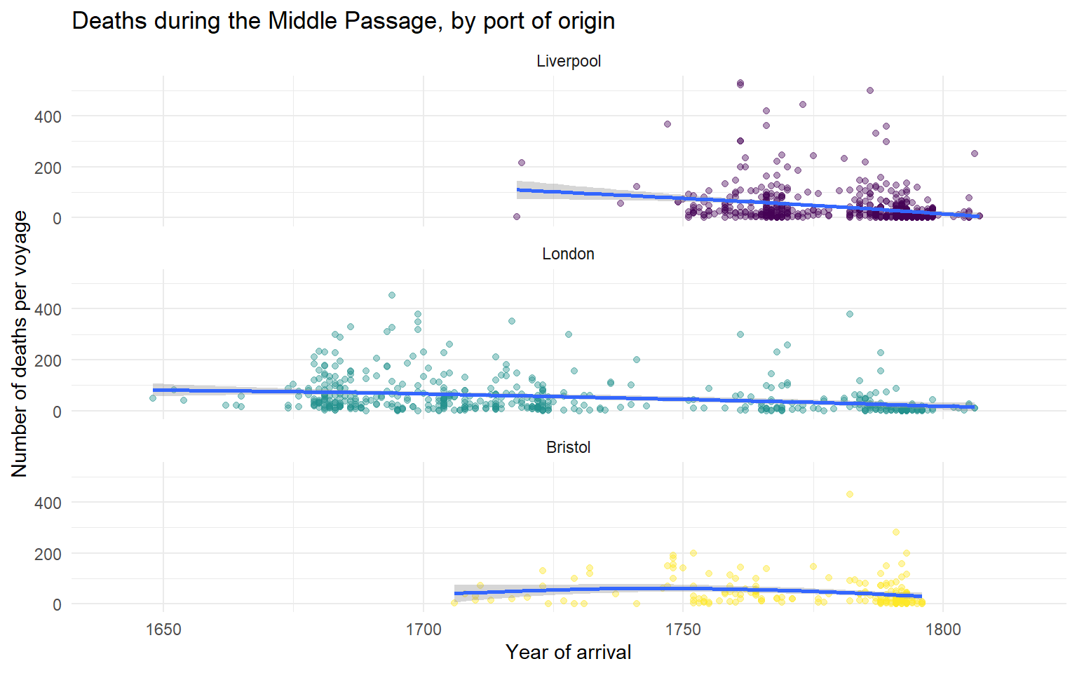
The base mapping for the smoother uses no colour mapping, so a single smoother is drawn per facet. Inside geom_point() we map colour = start_port so the points within each facet are coloured by port even though there is only one port per panel; this is purely decorative.
- Try changing
nrow = 3tonrow = 1and rendering. What happens?
TipActivity
Replace facet_wrap(~ start_port, nrow = 3) with facet_grid(start_port ~ .). Read the help with ?facet_grid to see when one is preferred over the other.
4.5 Overplotting
The earliest scatterplots in sec-basic-plots had so many overlapping points that the density of the data was hidden. Two techniques help.
alpha makes each point semi-transparent, so dense regions appear darker.
geom_jitter() adds a small random offset, so points stacked on the same value are visible separately.
opaque <- ggplot(dat_filter, aes(start_port, mortality)) +
  geom_point() +
  labs(title = "alpha = 1 (default)")

transparent <- ggplot(dat_filter, aes(start_port, mortality)) +
  geom_point(alpha = 0.1) +
  labs(title = "alpha = 0.1")

jittered <- ggplot(dat_filter, aes(start_port, mortality)) +
  geom_jitter(alpha = 0.2, width = 0.3, height = 0) +
  labs(title = "geom_jitter()")

opaque + transparent + jittered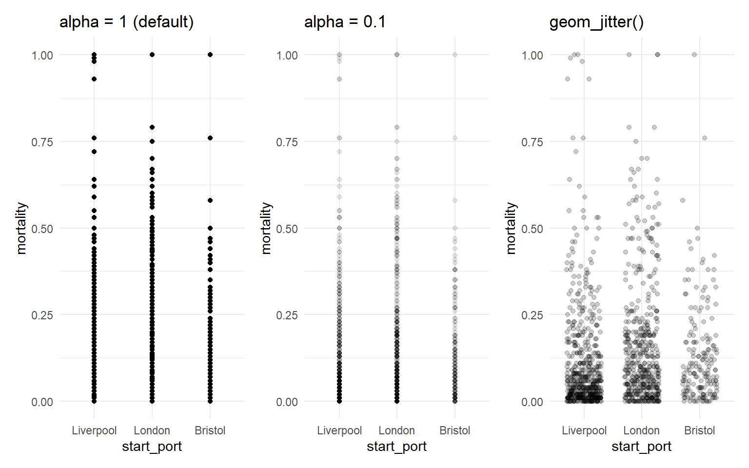
Warning
geom_jitter() moves points slightly. That is fine for showing density on a categorical axis, but if you jitter on a continuous axis you are misrepresenting the data. Set the width and height arguments deliberately. Here we use height = 0 so vertical positions are unchanged.