3 Customising plots
3.1 Intended learning outcomes
By the end of this chapter you will be able to:
- Use
scale_*functions to control axis labels, breaks and limits - Distinguish
coord_cartesian()fromscale_*limits - Apply built-in themes and set a global default with
theme_set() - Add titles, subtitles and captions with
labs() - Use the colour-blind-friendly
viridispalettes
3.2 Functions used
- ggplot2:
scale_x_discrete(),scale_x_continuous(),scale_y_continuous(),coord_cartesian(),scale_fill_viridis_d(),scale_colour_viridis_d(),labs(),theme_minimal(),theme_bw(),theme_classic(),theme_set() - scales:
label_comma()(replacement forscales::comma)
3.3 Scientific notation and number formatting
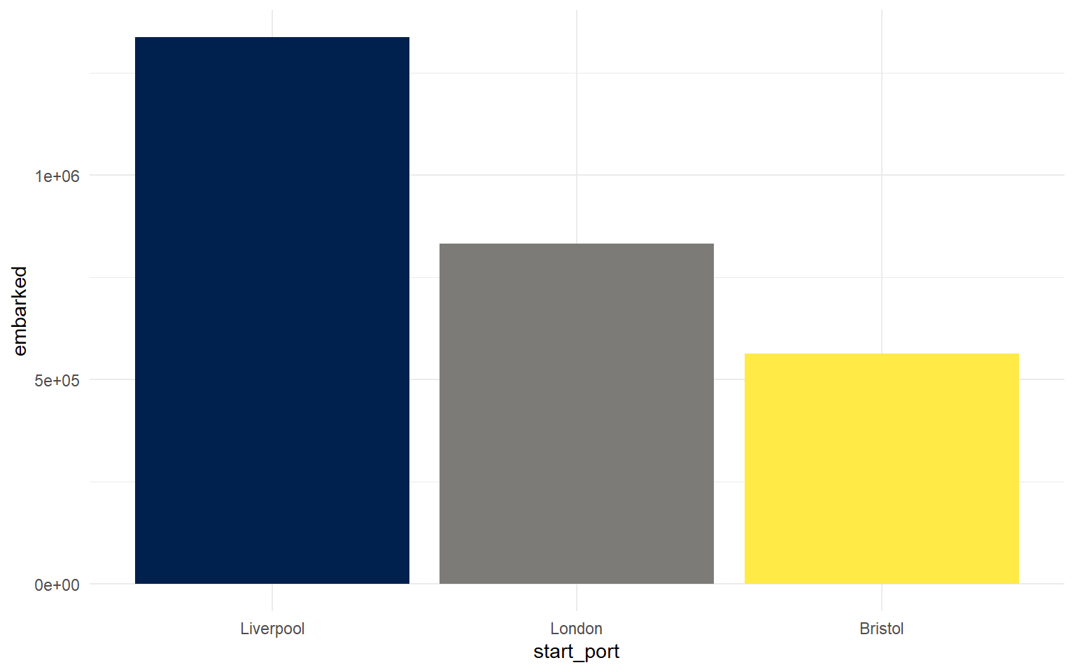
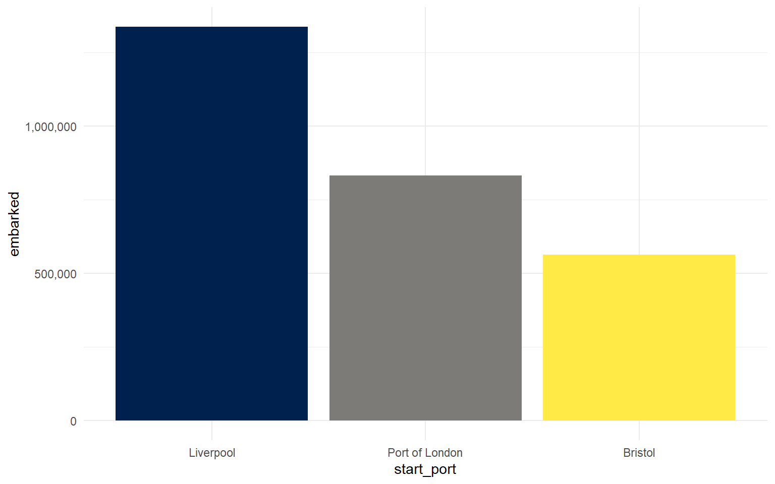
The column chart from sec-basic-plots uses scientific notation on the y-axis because the numbers are so large.
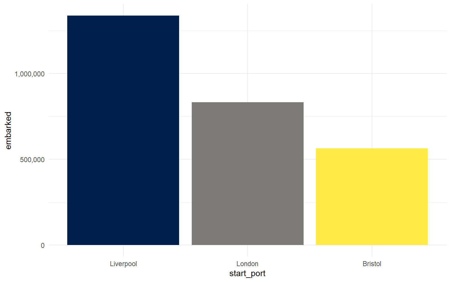
We can override that with scale_y_continuous() and a label-formatting function from the scales package.
Note
scales::label_comma() is the modern factory function. The older scales::comma (no parentheses) still works but is being phased out.
3.4 Axis labels and titles
labs() is the most concise way to set axis labels, the plot title, subtitle and caption.
ggplot(port_summary, aes(x = start_port, y = embarked, fill = start_port)) +
  geom_col(show.legend = FALSE) +
scale_fill_viridis_d(option = "E") +
scale_y_continuous(labels = scales::label_comma()) +
labs(x = "Port of origin",
y = "Number embarked",
title = "Number embarked on ships originating in British ports")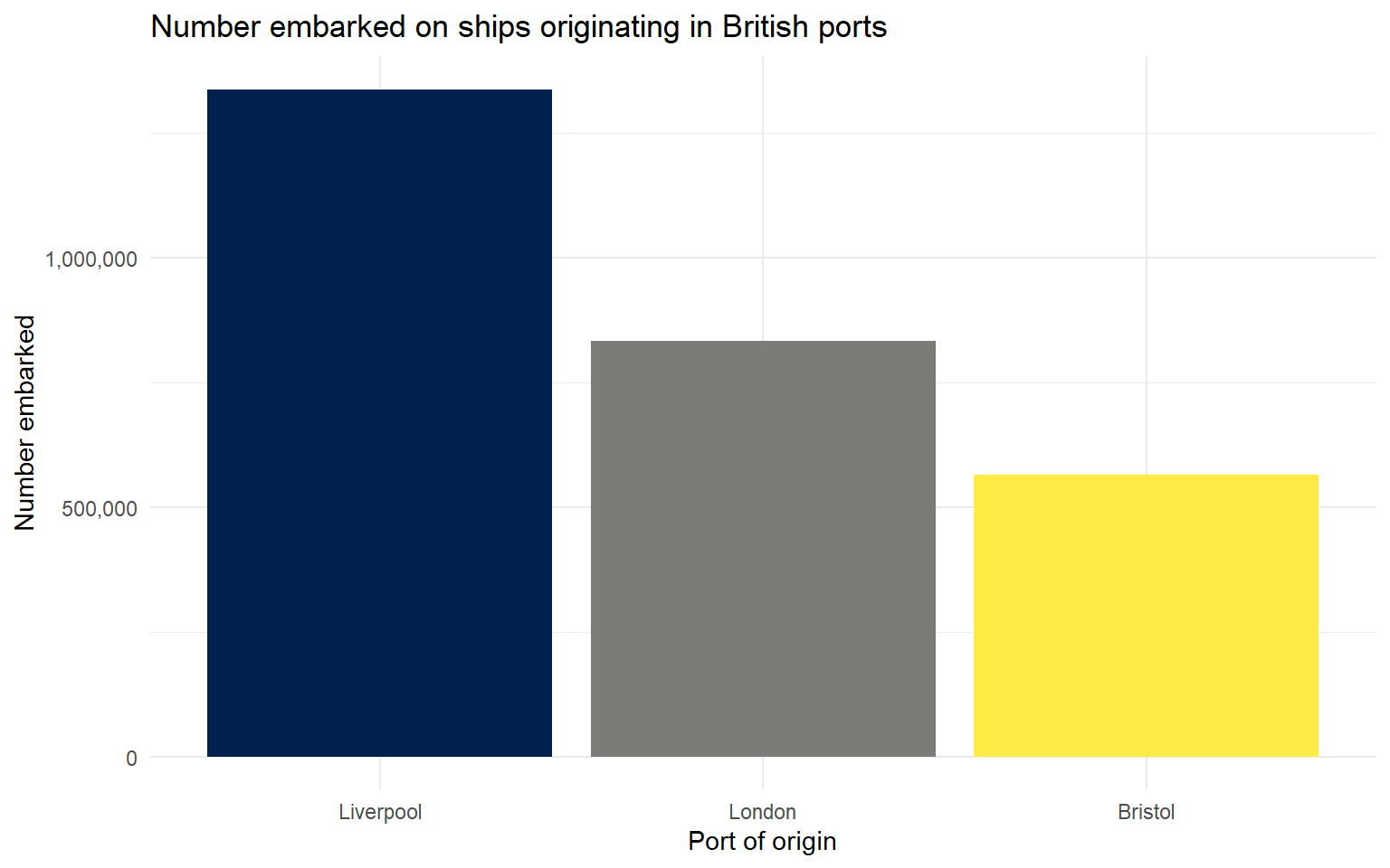
3.5 Themes
ggplot2 has several built-in themes. We have already set theme_minimal() as the global default in the project setup (see R/my_setup.R). You can override it for an individual plot by adding a different theme as a layer.
p <- ggplot(port_summary, aes(x = start_port, y = embarked, fill = start_port)) +
  geom_col(show.legend = FALSE) +
  scale_fill_viridis_d(option = "E") +
  scale_y_continuous(labels = scales::label_comma()) +
  labs(x = NULL, y = NULL)

(p + theme_minimal() + ggtitle("theme_minimal")) +
  (p + theme_bw() + ggtitle("theme_bw")) +
  (p + theme_classic() + ggtitle("theme_classic"))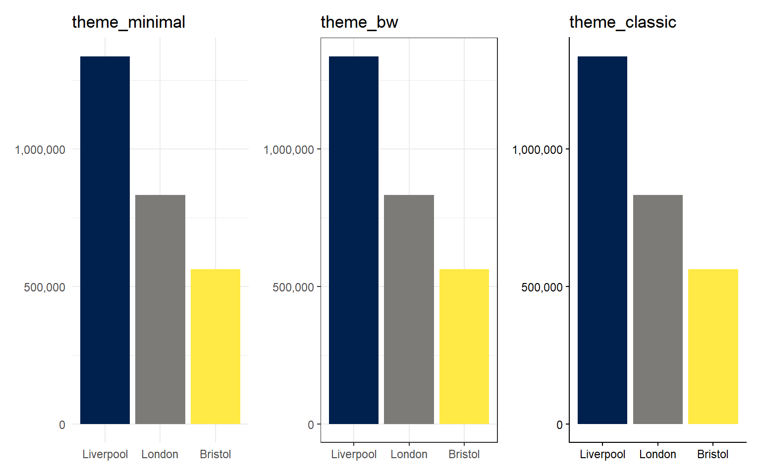
Tip
Type theme_ in the RStudio source pane and let auto-complete show you the available options. To set a theme for every subsequent plot in your script, run theme_set(theme_bw()) near the top.
3.6 Discrete x-axis labels
scale_x_discrete() lets you control the tick labels on a categorical axis without renaming the underlying data.
3.7 Axis limits the right way
There are two ways to restrict the visible range of an axis, and they behave differently.
coord_cartesian(xlim = c(...), ylim = c(...)) zooms in on the plot. Data outside the range are still used in calculations (such as drawing a smoother) and are simply cropped from view.
scale_x_continuous(limits = c(...)) filters the data. Any rows outside the range are dropped before geoms or smoothers see them. This can silently change a regression line, so it is usually the wrong choice.
crop <- ggplot(dat_filter, aes(arrival_year, total_embarked)) +
  geom_point(alpha = 0.2) +
  geom_smooth() +
  coord_cartesian(xlim = c(1700, 1815)) +
  labs(title = "coord_cartesian (crop)")

filt <- ggplot(dat_filter, aes(arrival_year, total_embarked)) +
  geom_point(alpha = 0.2) +
  geom_smooth() +
  scale_x_continuous(limits = c(1700, 1815)) +
  labs(title = "scale_x_continuous(limits=)")

crop + filt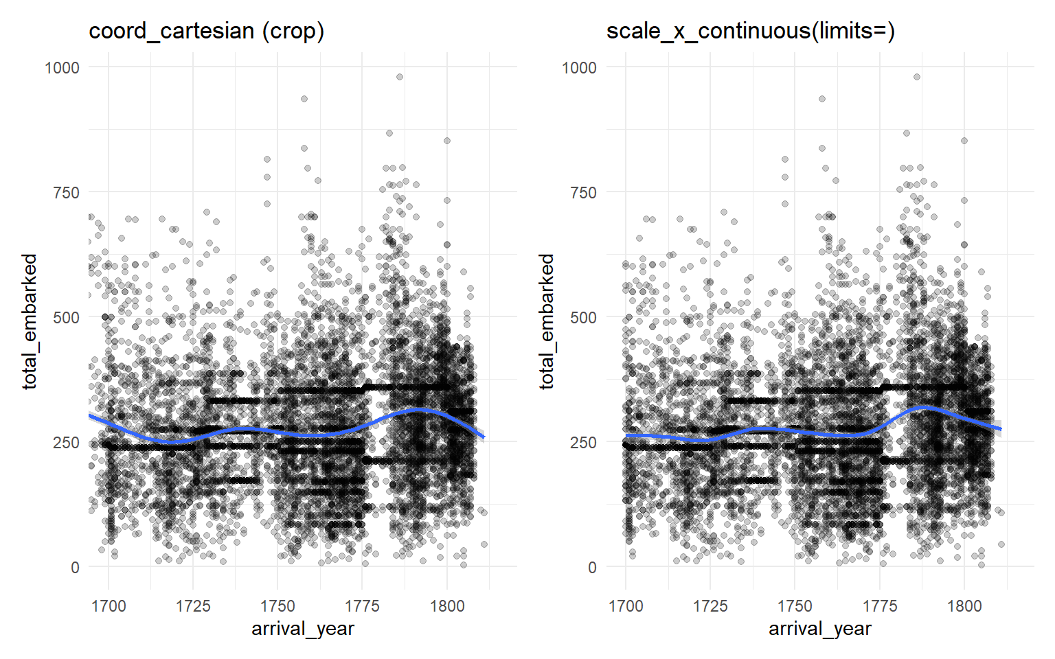
3.8 Viridis colour palettes
The default ggplot2 colours are not colour-blind friendly. The viridis family of palettes is and is now included in ggplot2. Use scale_fill_viridis_d() for discrete fill (a category mapped to fill), and scale_fill_viridis_c() for continuous fill (a number mapped to fill); equivalents exist for colour.
The option argument picks one of five palettes:
-
"A"magma -
"B"inferno -
"C"plasma -
"D"viridis (the default) -
"E"cividis (the most accessible)
make_plot <- function(opt) {
  ggplot(port_summary, aes(start_port, embarked, fill = start_port)) +
    geom_col(show.legend = FALSE) +
    scale_fill_viridis_d(option = opt) +
    labs(title = paste("option =", opt), x = NULL, y = NULL)
}

make_plot("A") + make_plot("B") + make_plot("C") +
  make_plot("D") + make_plot("E") +
  plot_layout(nrow = 2)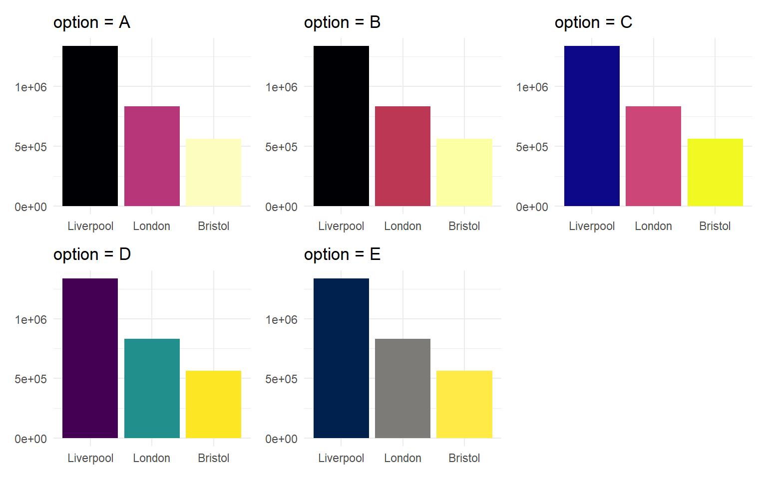
3.9 Activities
TipActivity 1
Apply the theme_classic() theme to the column chart of port totals and edit the y-axis label to “Total embarked (people)”.
NoteSolution
TipActivity 2
Replace scale_x_continuous(limits = c(1700, 1815)) in the right-hand panel above with coord_cartesian(xlim = c(1700, 1815)). Confirm that the smoother shape is the same as the left panel.