4 Section 2
For the second session, we're going to do a whistle-stop tour through the following paper:
The first half of the session will consolidate the skills and functions you learned in Session 1 with a bit of extra data wrangling, however, we'll use simulated experimental data so that you can start thinking about how you might plot types of data you're likely to encounter in research. The second half will present some more advanced plots. Please note that there is extra detail and context in the paper that may not be covered in this workshop so we'd encourage reading the full paper if you haven't already.
4.1 Set-up
Open your Workshop project and do the following:
- Create and save a new R Markdown document named Session 2. get rid of the default template text from line 11 onwards.
- Download the simulated dataset from the Open Science Framework and save it in your project folder.
- Add the below code to the set-up chunk and then run the code to load the packages and data.
4.2 Simulated dataset
For the purpose of this tutorial, we will use simulated data for a 2 x 2 mixed-design lexical decision task in which 100 participants must decide whether a presented word is a real word or a non-word. There are 100 rows (1 for each participant) and 7 variables:
-
Participant information:
-
id: Participant ID -
age: Age
-
-
1 between-subject independent variable (IV):
-
language: Language group (1 = monolingual, 2 = bilingual)
-
-
4 columns for the 2 dependent variables (DVs) of RT and accuracy, crossed by the within-subject IV of condition:
-
rt_word: Reaction time (ms) for word trials -
rt_nonword: Reaction time (ms) for non-word trials -
acc_word: Accuracy for word trials -
acc_nonword: Accuracy for non-word trials
-
4.3 Checking and cleaning your data
You should always check after importing data that the resulting table looks like you expect. To view the dataset, click dat in the environment pane or run View(dat) in the console. The environment pane also tells us that the object dat has 100 observations of 7 variables, and this is a useful quick check to ensure one has loaded the right data. Note that the 7 variables have an additional piece of information chr and num; this specifies the kind of data in the column. Similar to Excel and SPSS, R uses this information (or variable type) to specify allowable manipulations of data. For instance character data such as the id cannot be averaged, while it is possible to do this with numerical data such as the age.
4.3.1 Handling data types
Another useful check is to use the functions summary() and str() (structure) to check what kind of data R thinks is in each column. Run the below code and look at the output of each, comparing it with what you know about the simulated dataset:
Because the factor language is coded as 1 and 2, R has categorised this column as containing numeric information and unless we correct it, this will cause problems for visualisation and analysis. The code below shows how to recode numeric codes into labels.
-
mutate()makes new columns in a data table, or overwrites a column; -
factor()translates the language column into a factor with the labels "monolingual" and "bilingual". You can also usefactor()to set the display order of a column that contains words. Otherwise, they will display in alphabetical order. In this case we are replacing the numeric data (1 and 2) in thelanguagecolumn with the equivalent English labelsmonolingualfor 1 andbilingualfor 2. At the same time we will change the column type to be a factor, which is how R defines categorical data.
dat <- mutate(dat, language = factor(
  x = language, # column to translate
  levels = c(1, 2), # values of the original data in preferred order
  labels = c("monolingual", "bilingual") # labels for display
))
Make sure that you always check the output of any code that you run. If after running this code language is full of NA values, it means that you have run the code twice. The first time would have worked and transformed the values from 1 to monolingual and 2 to bilingual. If you run the code again on the same dataset, it will look for the values 1 and 2, and because there are no longer any that match, it will return NA. If this happens, you will need to reload the dataset from the csv file.
A good way to avoid this is never to overwrite data, but to always store the output of code in new objects (e.g., dat_recoded) or new variables (language_recoded). For the purposes of this tutorial, overwriting provides a useful teachable moment so we'll leave it as it is.
4.4 Basic plot recap
The code for the next couple of plots should be quite familiar from session 1. Before you run the code, try to visualise what it will look like from reading the code.
A bar chart of counts for the number of participants:
ggplot(dat, aes(language)) +
  geom_bar() +
  scale_x_discrete(name = "Language group",
                   labels = c("Monolingual", "Bilingual")) +
  scale_y_continuous(name = "Number of participants",
                     breaks = seq(from = 0, to = 50, by = 10))
A histogram of participant age:
ggplot(dat, aes(age)) +
  geom_histogram(binwidth = 1, fill = "wheat", color = "black") +
  scale_x_continuous(name = "Participant age (years)") +
  theme_minimal()
4.5 Data formats
To visualise the experimental reaction time and accuracy data using ggplot2, we first need to reshape the data from wide format to long format. This step can cause friction with novice users of R. Traditionally, psychologists have been taught data skills using wide-format data. Wide-format data typically has one row of data for each participant, with separate columns for each score or variable. For repeated-measures variables, the dependent variable is split across different columns. For between-groups variables, a separate column is added to encode the group to which a participant or observation belongs.
The simulated lexical decision data is currently in wide format (see Table 4.1), where each participant's aggregated reaction time and accuracy for each level of the within-subject variable is split across multiple columns for the repeated factor of condition (words versus non-words).
| id | age | language | rt_word | rt_nonword | acc_word | acc_nonword |
|---|---|---|---|---|---|---|
| S001 | 22 | monolingual | 379.46 | 516.82 | 99 | 90 |
| S002 | 33 | monolingual | 312.45 | 435.04 | 94 | 82 |
| S003 | 23 | monolingual | 404.94 | 458.50 | 96 | 87 |
| S004 | 28 | monolingual | 298.37 | 335.89 | 92 | 76 |
| S005 | 26 | monolingual | 316.42 | 401.32 | 91 | 83 |
| S006 | 29 | monolingual | 357.17 | 367.34 | 96 | 78 |
Moving from using wide-format to long-format datasets can require a conceptual shift on the part of the researcher and one that usually only comes with practice and repeated exposure. It may be helpful to make a note that “row = participant” (wide format) and “row = observation” (long format) until you get used to moving between the formats.
For our example dataset, adhering to these rules for reshaping the data would produce Table 4.2. Rather than different observations of the same dependent variable being split across columns, there is now a single column for the DV reaction time, and a single column for the DV accuracy. Each participant now has multiple rows of data, one for each observation (i.e., for each participant there will be as many rows as there are levels of the within-subject IV). Although there is some repetition of age and language group, each row is unique when looking at the combination of measures.
| id | age | language | condition | rt | acc |
|---|---|---|---|---|---|
| S001 | 22 | monolingual | word | 379.46 | 99 |
| S001 | 22 | monolingual | nonword | 516.82 | 90 |
| S002 | 33 | monolingual | word | 312.45 | 94 |
| S002 | 33 | monolingual | nonword | 435.04 | 82 |
| S003 | 23 | monolingual | word | 404.94 | 96 |
| S003 | 23 | monolingual | nonword | 458.50 | 87 |
The benefits and flexibility of this format will hopefully become apparent as we progress through the workshop, however, a useful rule of thumb when working with data in R for visualisation is that anything that shares an axis should probably be in the same column. For example, a simple boxplot showing reaction time by condition would display the variable condition on the x-axis with bars representing both the word and nonword data, and rt on the y-axis. Therefore, all the data relating to condition should be in one column, and all the data relating to rt should be in a separate single column, rather than being split like in wide-format data.
4.5.1 Wide to long format
We have chosen a 2 x 2 design with two DVs, as we anticipate that this is a design many researchers will be familiar with and may also have existing datasets with a similar structure. However, it is worth normalising that trial-and-error is part of the process of learning how to apply these functions to new datasets and structures. Data visualisation can be a useful way to scaffold learning these data transformations because they can provide a concrete visual check as to whether you have done what you intended to do with your data.
4.5.1.1 Step 1: Split the dataset
There are multiple ways to handle a dataset that has more than one DV (and in this tutorial we'll actually use a different approach to the one in the original paper). One method that generalises quite well is to split the dataset, transform each variable separately, and then combine them.
Whilst this can seem like a more convoluted approach, it can actually prevent a lot of issues. We're going to split the data into three different objects, one that contains the demographic data, on that contains the reaciton time data, and one that contains the accuracy data. We need to be able to join them all back together, so for all three wa want the participant ID so that we can match it all back up.
For both rt and acc, rather than typing out the columns we use starts_with(). Given there's only two columns it wouldn't take much time to type out the names but this approach will scale up if you have a much large dataset.
dat_demo <- select(dat, id, age, language)
dat_rt <- select(dat, id,starts_with("rt"))
dat_acc <- select(dat, id,starts_with("acc"))
4.5.1.2 Step 2: Rename
In the original dataset, we needed to have distinct names for each column but this will cause us issues when we try and match everything back up, so we use rename to rename the condition columns to just word and nonword.
4.5.1.3 Step 3: pivot_longer()
Now we can use the function pivot_longer() to transform the data to long-form and we'll start with the reaction time data.
The pivot functions can be easier to show than tell - you may find it a useful exercise to run the below code and compare the newly created object long (Table 4.3) with the original dat Table 4.1 before reading on.
long_rt <- pivot_longer(data = dat_rt,
                     cols = word:nonword,
                     names_to = "condition",
                     values_to = "rt")
As with the other tidyverse functions, the first argument specifies the dataset to use as the base, in this case
dat. This argument name is often dropped in examples.colsspecifies all the columns you want to transform. The easiest way to visualise this is to think about which columns would be the same in the new long-form dataset and which will change. This is one of the reasons why splitting the dataset can be simpler, generally, the columns you want to change are everything but the ID column. The colon notationfirst_column:last_columnis used to select all variables from the first column specified to the last In our code,colsspecifies that the columns we want to transform arewordtononword.names_tospecifies the name of the new column that will be created. This column will contain the names of the selected existing columns.Finally,
values_tonames the new column that will contain the values in the selected columns. In this case we'll call itdv.
At this point you may find it helpful to go back and compare dat and long again to see how each argument matches up with the output of the table.
| id | condition | rt |
|---|---|---|
| S001 | word | 379.46 |
| S001 | nonword | 516.82 |
| S002 | word | 312.45 |
| S002 | nonword | 435.04 |
| S003 | word | 404.94 |
| S003 | nonword | 458.50 |
4.5.1.4 Step 4: pivot_longer() again
Now, create a variable named long_acc that transforms the accuracy data to long-form.
long_acc <- pivot_longer(data = dat_acc,
                     cols = word:nonword,
                     names_to = "condition",
                     values_to = "acc")
4.5.1.5 Step 5: Join it back together
Now we have our two long-form data sets, we can join it all back together. You can only join two datasets together at once so the first step of this is to join the demographic dataset to the reaction time data, and then we join the accuracy data to this.
by should list all the variables the dataset has in common. In the first join, it's just id but in the second, we also have condition. This allows the join to match up the data correctly.
dat_long <- inner_join(x = dat_demo, y = long_rt, by = c("id")) %>%
  inner_join(long_acc, by = c("id", "condition"))
Now that we have the experimental data in the right form, we can begin to create some useful visualizations. First, to demonstrate how code recipes can be reused and adapted, we will create histograms of reaction time and accuracy. The below code uses the same template as before but changes the dataset (dat_long), the bin-widths of the histograms, the x variable to display (rt/acc), and the name of the x-axis.
hist1<- ggplot(dat_long, aes(x = rt)) +
  geom_histogram(binwidth = 10, fill = "white", colour = "black") +
  scale_x_continuous(name = "Reaction time (ms)")

hist2 <-ggplot(dat_long, aes(x = acc)) +
  geom_histogram(binwidth = 1, fill = "white", colour = "black") +
  scale_x_continuous(name = "Accuracy (0-100)")

hist1 / hist2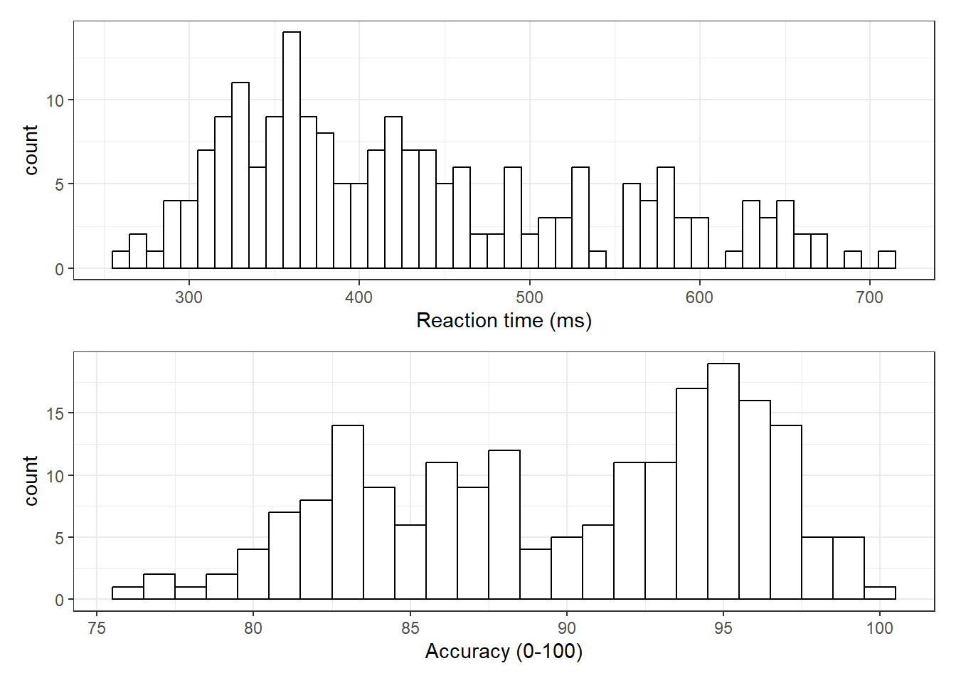
Figure 4.1: Histograms showing the distribution of reaction time (top) and accuracy (bottom)
4.5.2 Long to wide format
Following the rule that anything that shares an axis should probably be in the same column means that we will frequently need our data in long-form when using ggplot2, However, there are some cases when wide format is necessary. For example, we may wish to visualise the relationship between reaction time in the word and non-word conditions. This requires that the corresponding word and non-word values for each participant be in the same row. The easiest way to achieve this in our case would simply be to use the original wide-format data as the input:
ggplot(dat, aes(x = rt_word, y = rt_nonword)) +
  geom_point() +
  geom_smooth(method = "lm")
## `geom_smooth()` using formula = 'y ~ x'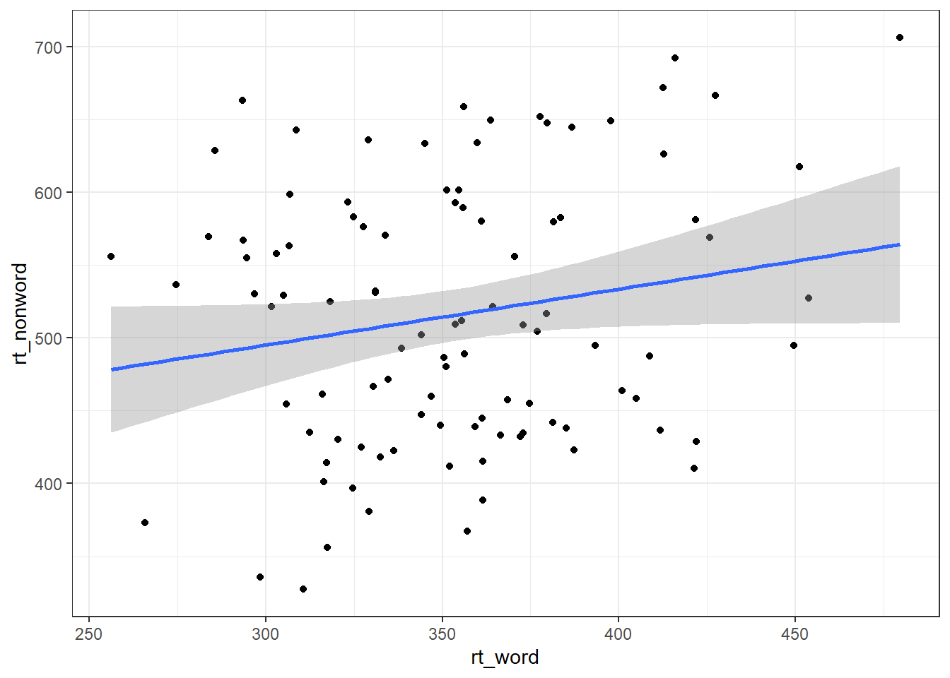
However, there may also be cases when you do not have an original wide-format version and you can use the pivot_wider() function to transform from long to wide.
dat_wide <- dat_long %>%
  pivot_wider(id_cols = "id",
              names_from = "condition",
values_from = c(rt,acc))| id | rt_word | rt_nonword | acc_word | acc_nonword |
|---|---|---|---|---|
| S001 | 379.4585 | 516.8176 | 99 | 90 |
| S002 | 312.4513 | 435.0404 | 94 | 82 |
| S003 | 404.9407 | 458.5022 | 96 | 87 |
| S004 | 298.3734 | 335.8933 | 92 | 76 |
| S005 | 316.4250 | 401.3214 | 91 | 83 |
| S006 | 357.1710 | 367.3355 | 96 | 78 |
4.6 Grouped plots
In the long-form dataset, because each variable has its own column, it's much easier to specify that you want to create grouped plots.
For example, we can create grouped density plots by adding fill = condition:
ggplot(dat_long, aes(x = rt, fill = condition)) +
  geom_density(alpha = 0.75)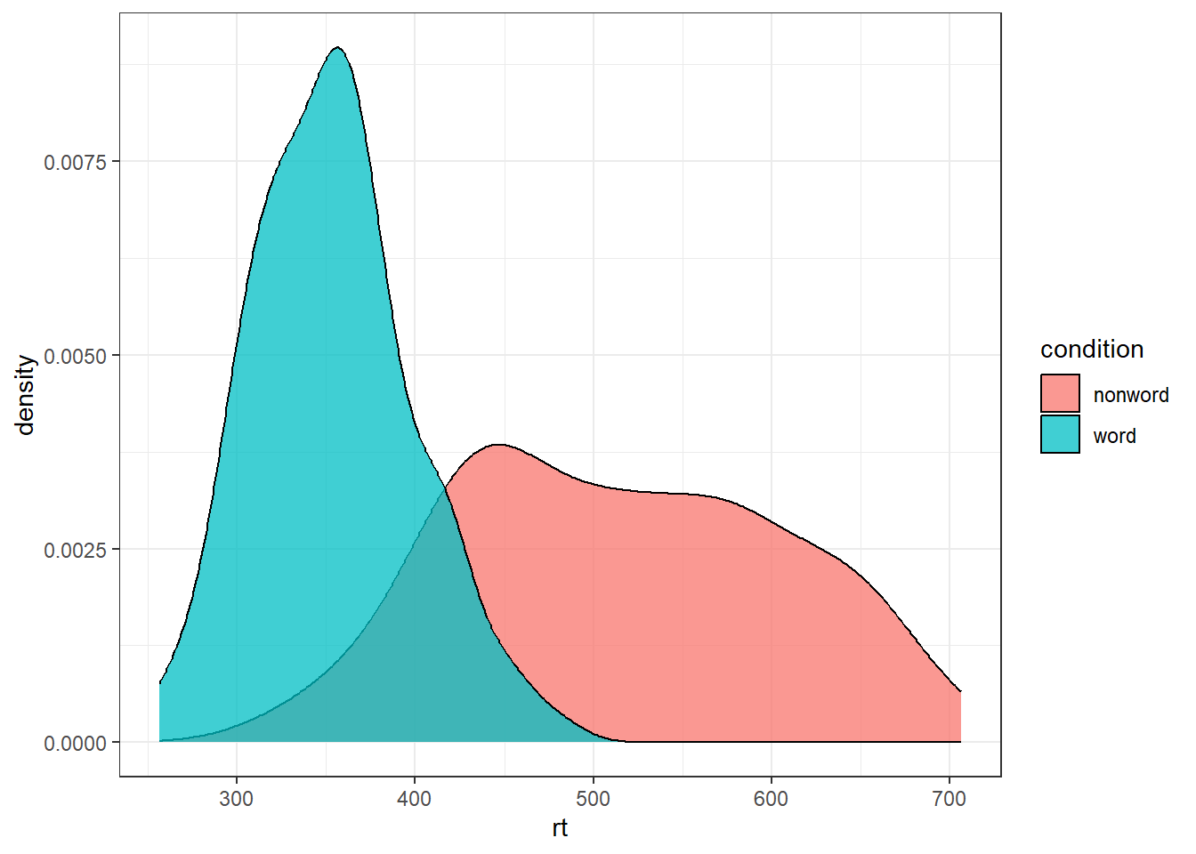
And grouped scatterplots by adding colour = condition:
ggplot(dat_long, aes(x = rt, y = age, colour = condition)) +
  geom_point() +
  geom_smooth(method = "lm")
## `geom_smooth()` using formula = 'y ~ x'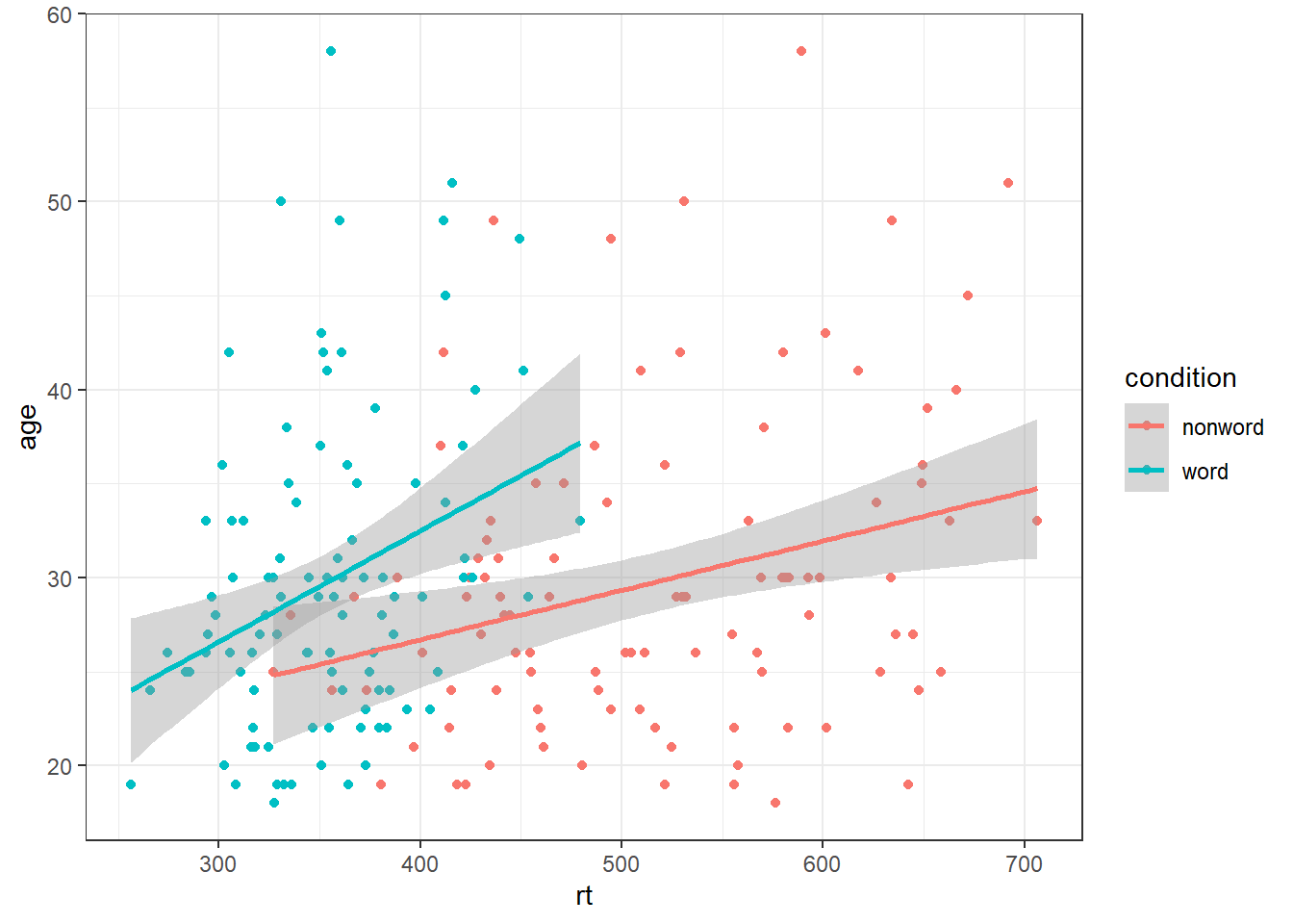
4.7 Accessible colour schemes
One of the drawbacks of using ggplot2 for visualisation is that the default colour scheme is not accessible (or visually appealing). The red and green default palette is difficult for colour-blind people to differentiate, and also does not display well in greyscale. You can specify exact custom colours for your plots, but one easy option is to use a custom colour palette. These take the same arguments as their default scale sister functions for updating axis names and labels, but display plots in contrasting colours that can be read by colour-blind people and that also print well in grey scale. For categorical colours, the "Set2", "Dark2" and "Paired" palettes from the brewer scale functions are colourblind-safe (but are hard to distinhuish in greyscale). For continuous colours, such as when colour is representing the magnitude of a correlation in a tile plot, the viridis scale functions provide a number of different colourblind and greyscale-safe options.
ggplot(dat_long, aes(x = rt, y = age, colour = condition)) +
  geom_point() +
  geom_smooth(method = "lm") +
  scale_color_brewer(palette = "Dark2",
                     name = "Condition",
                     labels = c("Non-word", "Word"))
## `geom_smooth()` using formula = 'y ~ x'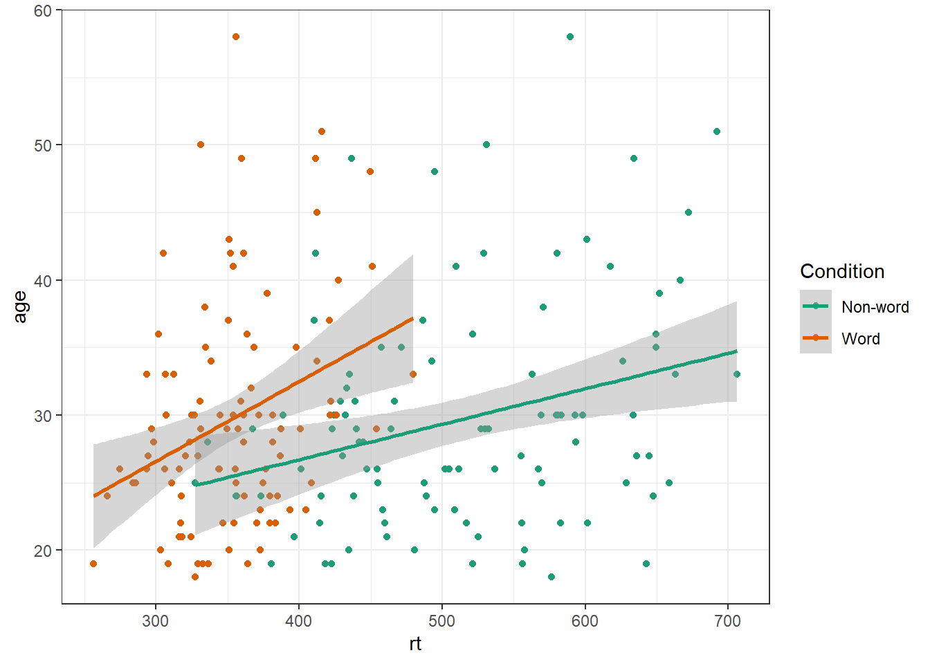
4.8 Visualising summary statistis
Commonly, rather than visualising distributions of raw data, researchers will wish to visualise means using a bar chart with error bars. As with SPSS and Excel, ggplot2 requires you to calculate the summary statistics and then plot the summary. There are at least two ways to do this, in the first you make a table of summary statistics and then plot that table. The second approach is to calculate the statistics within a layer of the plot. That is the approach we will use below.
First we present code for making a bar chart. The code for bar charts is here because it is a common visualisation that is familiar to most researchers. However, we would urge you to use a visualisation that provides more transparency about the distribution of the raw data, such as violin-boxplots .
To summarise the data into means, we use stat_summary(). Rather than calling a geom_* function, we call stat_summary() and specify how we want to summarise the data and how we want to present that summary in our figure.
funspecifies the summary function that gives us the y-value we want to plot, in this case,mean.geomspecifies what shape or plot we want to use to display the summary. For the first layer we will specifybar. As with the other geom-type functions we have shown you, this part of thestat_summary()function is tied to the aesthetic mapping in the first line of code. The underlying statistics for a bar chart means that we must specify and IV (x-axis) as well as the DV (y-axis).
ggplot(dat_long, aes(x = condition, y = rt)) +
  stat_summary(fun = "mean", geom = "bar")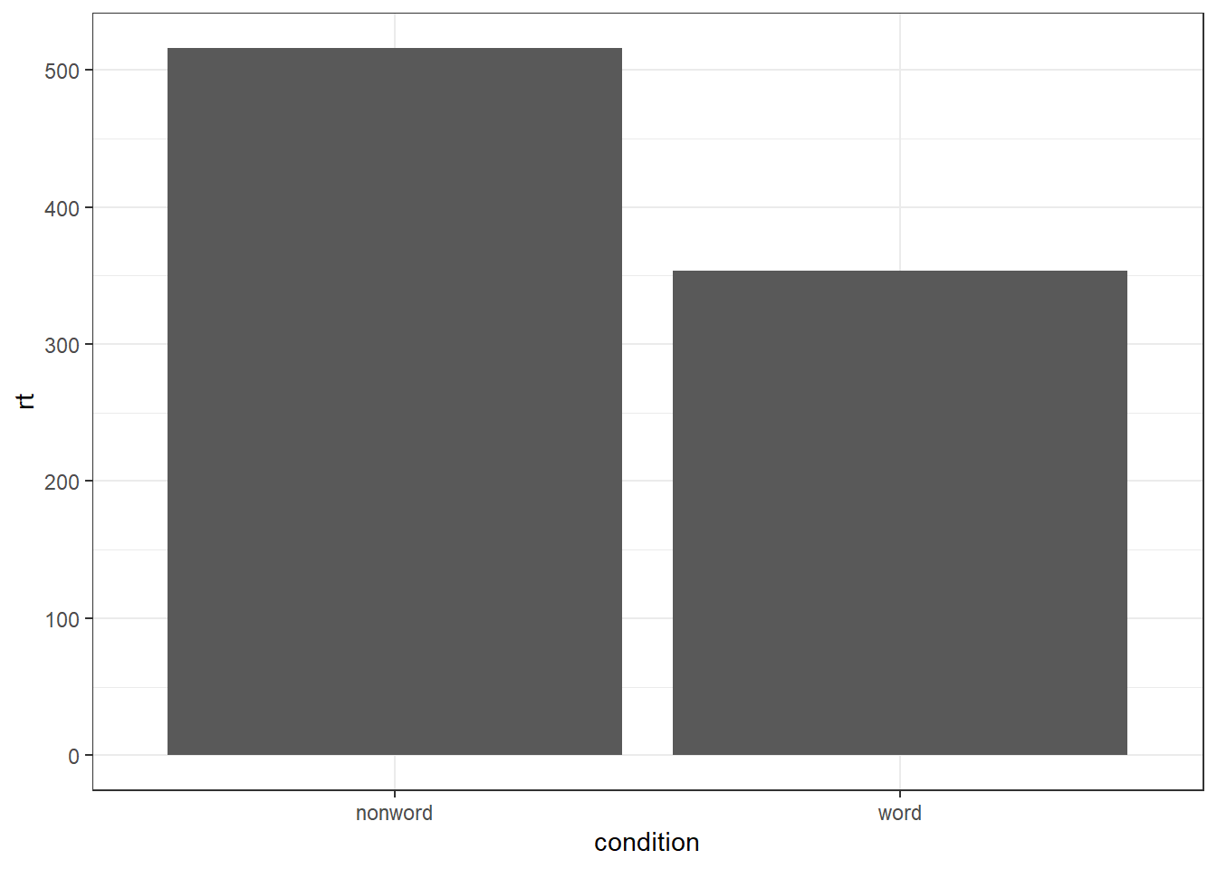
To add the error bars, another layer is added with a second call to stat_summary. This time, the function represents the type of error bars we wish to draw, you can choose from mean_se for standard error, mean_cl_normal for confidence intervals (this requires you to have installed the package Hmisc), or mean_sdl for standard deviation. width controls the width of the error bars - try changing the value to see what happens.
- Whilst
funreturns a single value (y) per condition,fun.datareturns the y-values we want to plot plus their minimum and maximum values, in this case,mean_se
ggplot(dat_long, aes(x = condition, y = rt)) +
  stat_summary(fun = "mean", geom = "bar") +
  stat_summary(fun.data = "mean_se",
               geom = "errorbar",
               width = .2)
4.8.1 Grouped violin-boxplots
As with previous plots, another variable can be mapped to fill for the violin-boxplot and we can also use stat_summary() to add in the mean and errorbars. However, simply adding fill to the mapping causes the different components of the plot to become misaligned because they have different default positions:
ggplot(dat_long, aes(x = condition, y= rt, fill = language)) +
  geom_violin() +
  geom_boxplot(width = .2,
               fatten = NULL) +
  stat_summary(fun = "mean",  geom = "point") +
  stat_summary(fun.data = "mean_se",
               geom = "errorbar",
               width = .1) +
  scale_fill_brewer(palette = "Dark2")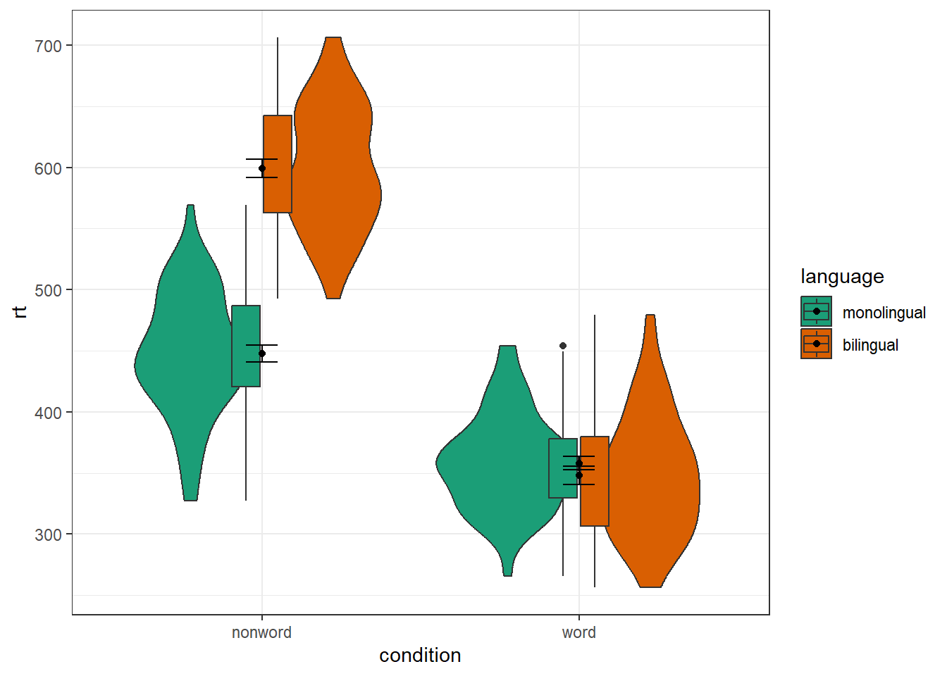
To rectify this we need to adjust the argument position for each of the misaligned layers. position_dodge() instructs R to move (dodge) the position of the plot component by the specified value; finding what value looks best can sometimes take trial and error. We can also set the alpha values to make it easier to distinguish each layer of the plot.
ggplot(dat_long, aes(x = condition, y= rt, fill = language)) +
  geom_violin(alpha = 0.25, position = position_dodge(0.9)) +
  geom_boxplot(width = .2,
               fatten = NULL,
               alpha = 0.75,
               position = position_dodge(0.9)) +
  stat_summary(fun = "mean",
               geom = "point",
               position = position_dodge(0.9)) +
  stat_summary(fun.data = "mean_se",
               geom = "errorbar",
               width = .1,
               position = position_dodge(0.9)) +
  scale_fill_brewer(palette = "Dark2")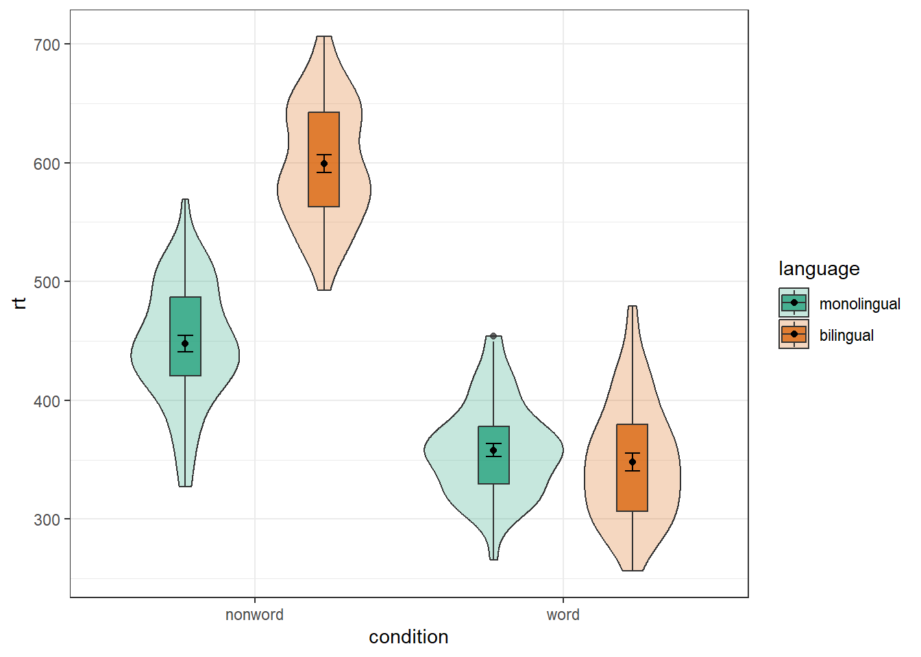
4.8.2 Combined interaction plots
A more complex interaction plot can be produced that takes advantage of the layers to visualise not only the overall interaction, but the change across conditions for each participant.
This code is more complex than all prior code because it does not use a universal mapping of the plot aesthetics. In our code so far, the aesthetic mapping (aes) of the plot has been specified in the first line of code because all layers used the same mapping. However, is is also possible for each layer to use a different mapping -- we encourage you to build up the plot by running each line of code sequentially to see how it all combines.
- The first call to
ggplot()sets up the default mappings of the plot that will be used unless otherwise specified - thex,yandgroupvariable. Note the addition ofshape, which will vary the shape of the geom according to the language variable. -
geom_point()overrides the default mapping by setting its owncolourto draw the data points from each language group in a different colour.alphais set to a low value to aid readability. - Similarly,
geom_line()overrides the default grouping variable so that a line is drawn to connect the individual data points for each participant (group = id) rather than each language group, and also sets the colours.
- Finally, the calls to
stat_summary()remain largely as they were, with the exception of settingcolour = "black"andsize = 2so that the overall means and error bars can be more easily distinguished from the individual data points. Because they do not specify an individual mapping, they use the defaults (e.g., the lines are connected by language group). For the error bars, the lines are again made solid.
ggplot(dat_long, aes(x = condition, y = rt,
                     group = language, shape = language)) +
  # adds raw data points in each condition
  geom_point(aes(colour = language),alpha = .2) +
  # add lines to connect each participant's data points across conditions
  geom_line(aes(group = id, colour = language), alpha = .2) +
  # add data points representing cell means
  stat_summary(fun = "mean", geom = "point", size = 2, colour = "black") +
  # add lines connecting cell means by condition
  stat_summary(fun = "mean", geom = "line", colour = "black") +
  # add errorbars to cell means
  stat_summary(fun.data = "mean_se", geom = "errorbar",
               width = .2, colour = "black") +
  # change colours and theme
  scale_color_brewer(palette = "Dark2") +
  theme_minimal()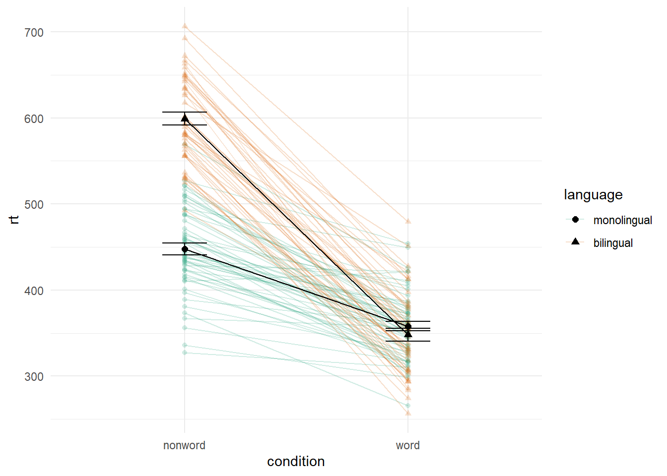
Figure 4.2: Interaction plot with by-participant data.
4.9 Facets
There are situations in which it may be useful to create separate plots for each level of a variable using facets. This can also help with accessibility when used instead of or in addition to group colours. The below code is an adaptation of the code used to produce the grouped scatterplot in which it may be easier to see how the relationship changes when the data are not overlaid.
- Rather than using
colour = conditionto produce different colours for each level ofcondition, this variable is instead passed tofacet_wrap().
ggplot(dat_long, aes(x = rt, y = age)) +
  geom_point() +
  geom_smooth(method = "lm") +
  facet_wrap(~condition, nrow = 2)
## `geom_smooth()` using formula = 'y ~ x'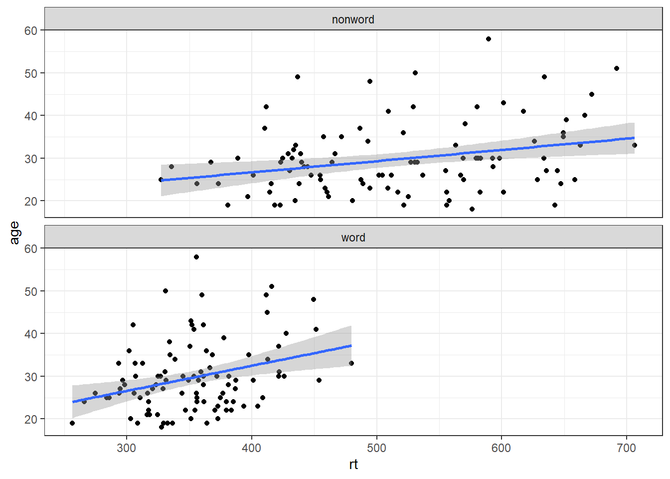
Figure 4.3: Faceted scatterplot
As another example, we can use facet_wrap() as an alternative to the grouped violin-boxplot ( in which the variable language is passed to facet_wrap() rather than fill.
ggplot(dat_long, aes(x = condition, y= rt)) +
  geom_violin() +
  geom_boxplot(width = .2, fatten = NULL) +
  stat_summary(fun = "mean", geom = "point") +
  stat_summary(fun.data = "mean_se", geom = "errorbar", width = .1) +
  facet_wrap(~language) +
  theme_minimal()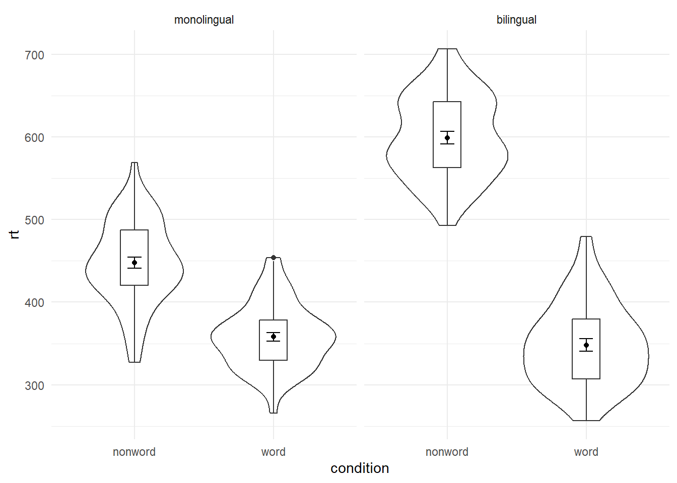
Figure 4.4: Facted violin-boxplot
4.10 Axis labels
Previously when we edited the main axis labels we used the scale_* functions. These functions are useful to know because they allow you to customise many aspects of the scale, such as the breaks and limits. However, if you only need to change the main axis name, there is a quicker way to do so using labs(). The below code adds a layer to the plot that changes the axis labels for the histogram saved in p1 and adds a title and subtitle. The title and subtitle do not conform to APA standards (more on APA formatting in the additional resources), however, for presentations and social media they can be useful.
ggplot(dat, aes(age)) +
  geom_histogram(binwidth = 1, fill = "wheat", color = "black") +
  labs(x = "Age", title = "Histogram of participant ages", subtitle = "Full sample")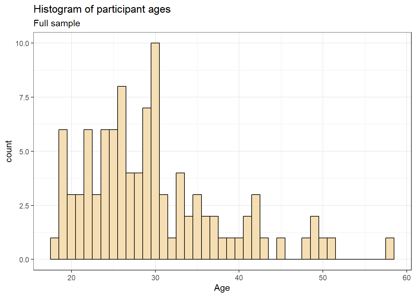
You can also use labs() to remove axis labels, for example, try adjusting the above code to x = NULL.
4.11 Redundant aesthetics
So far when we have produced plots with colours, the colours were the only way that different levels of a variable were indicated, but it is sometimes preferable to indicate levels with both colour and other means, such as facets or x-axis categories.
The code below adds fill = condition to violin-boxplots. We adjust alpha and use the brewer colour palette to customise the colours. Specifying a fill variable means that by default, R produces a legend for that variable. However, the use of colour is redundant with the x-axis labels, so you can remove this legend with the guides function.
ggplot(dat_long, aes(x = condition, y= rt, fill = condition)) +
  geom_violin(alpha = .4) +
  geom_boxplot(width = .2, fatten = NULL, alpha = .6) +
  stat_summary(fun = "mean", geom = "point") +
  stat_summary(fun.data = "mean_se", geom = "errorbar", width = .1) +
  theme_minimal() +
  scale_fill_brewer(palette = "Dark2") +
  guides(fill = "none")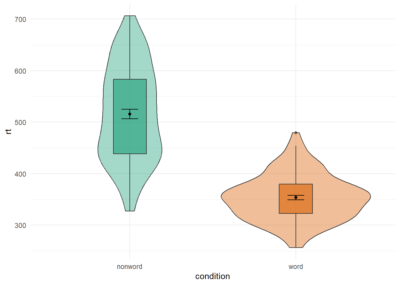
4.12 Advanced Plots
For the advanced plots, we will use some custom functions: geom_split_violin() and geom_flat_violin(), which you can access through the introdataviz package. These functions are modified from (raincloudplots?).
# how to install the introdataviz package to get split and half violin plots
devtools::install_github("psyteachr/introdataviz")

# if you get the error "there is no package called "devtools" run:
# install.packages("devtools")
4.12.1 Split-violin plots
Split-violin plots remove the redundancy of mirrored violin plots and make it easier to compare the distributions between multiple conditions.
ggplot(dat_long, aes(x = condition, y = rt, fill = language)) +
  introdataviz::geom_split_violin(alpha = .4) +
  geom_boxplot(width = .2, alpha = .6) +
  stat_summary(fun.data = "mean_se", geom = "pointrange",
               position = position_dodge(.175)) +
  scale_x_discrete(name = "Condition", labels = c("Non-word", "Word")) +
  scale_y_continuous(name = "Reaction time (ms)",
                     breaks = seq(200, 800, 100),
                     limits = c(200, 800)) +
  scale_fill_brewer(palette = "Dark2", name = "Language group") +
  theme_minimal()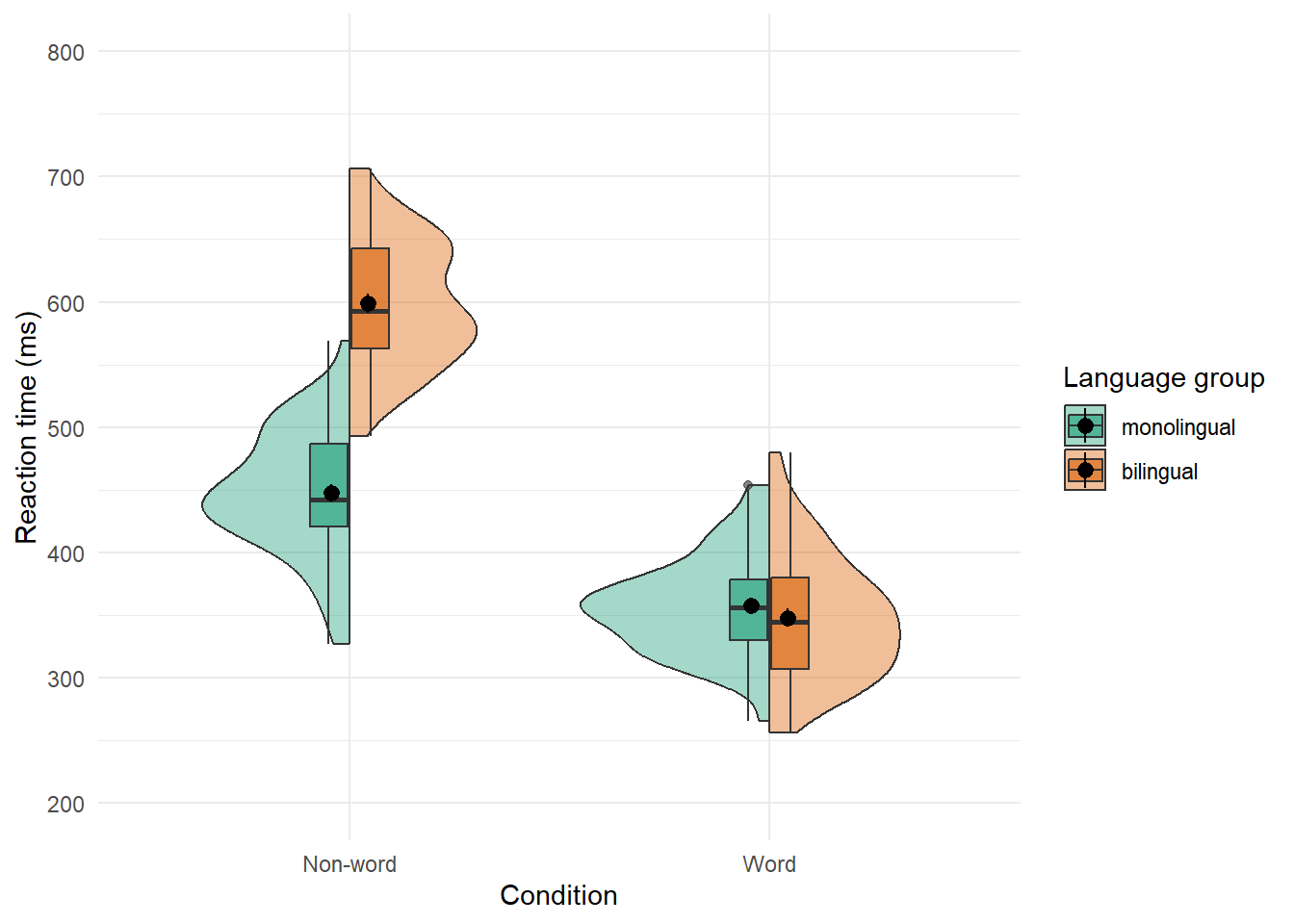
4.13 Raincloud plots
Raincloud plots combine a density plot, boxplot, raw data points, and any desired summary statistics for a complete visualisation of the data. They are so called because the density plot plus raw data is reminiscent of a rain cloud. The point and line in the centre of each cloud represents its mean and 95% CI. The rain represents individual data points.
rain_height <- .1

ggplot(dat_long, aes(x = "", y = rt, fill = language)) +
  # clouds
  introdataviz::geom_flat_violin(alpha = 0.4,
    position = position_nudge(x = rain_height+.05)) +
  # rain
  geom_point(aes(colour = language), size = 2, alpha = .5,
              position = position_jitter(width = rain_height, height = 0)) +
  # boxplots
  geom_boxplot(width = rain_height, alpha = 0.4,
               position = position_nudge(x = -rain_height*2)) +
  # mean and SE point in the cloud
  stat_summary(fun.data = mean_cl_normal, mapping = aes(color = language),
               position = position_nudge(x = rain_height * 3)) +
  # adjust layout
  scale_x_discrete(name = "", expand = c(rain_height*3, 0, 0, 0.7)) +
  scale_y_continuous(name = "Reaction time (ms)",
                     breaks = seq(200, 800, 100),
                     limits = c(200, 800)) +
  coord_flip() +
  facet_wrap(~factor(condition,
                     levels = c("word", "nonword"),
                     labels = c("Word", "Non-Word")),
             nrow = 2) +
  # custom colours and theme
  scale_fill_brewer(palette = "Dark2", name = "Language group") +
  scale_colour_brewer(palette = "Dark2") +
  theme_minimal() +
  theme(panel.grid.major.y = element_blank(),
        legend.position = c(0.8, 0.8),
        legend.background = element_rect(fill = "white", color = "white")) +
  guides(fill = "none")
## Warning: Using the `size` aesthetic with geom_polygon was deprecated in ggplot2 3.4.0.
## ℹ Please use the `linewidth` aesthetic instead.
## This warning is displayed once every 8 hours.
## Call `lifecycle::last_lifecycle_warnings()` to see where this warning was
## generated.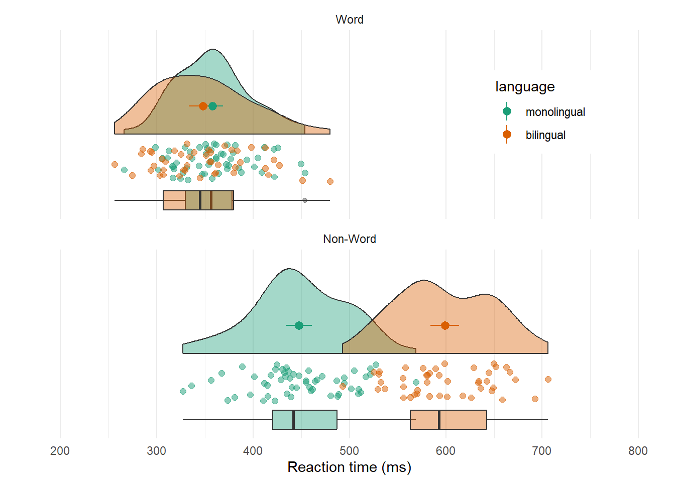
4.14 Further Resources
- Applied Data Skils: Data visualisation (from the PsyTeachR team)
- Applied Data Skils: Customising visualisations (from the PsyTeachR team)
- ggplot2 cheat sheet
- Data visualisation using R, for researchers who don't use R
- Chapter 3: Data Visualisation of R for Data Science
- ggplot2 FAQs
- ggplot2 documentation
- Hack Your Data Beautiful workshop by University of Glasgow postgraduate students
- Chapter 28: Graphics for communication of R for Data Science
- gganimate: A package for making animated plots
- The R Graph Gallery (this is really useful)
- Look at Data from Data Vizualization for Social Science
- Graphs in Cookbook for R
- Top 50 ggplot2 Visualizations
- R Graphics Cookbook by Winston Chang
- ggplot extensions
- plotly for creating interactive graphs
- Drawing Beautiful Maps Programmatically