Chapter 2 Data visualisation
2.1 Set-up
The Slave Voyages website contains a huge amount of data. For this tutorial I will provide a specific subset but you can explore the dataset further and download your own version.
For the purpose of this tutorial, please download this data in order to replicate my analyses and output exactly. This data is a subset of all the available dataset, and focuses on slave ships that originated in Britain.
For this tutorial you will find it helpful to write your code in RMarkdown. Not only does Markdown make it easy to write additional notes alongside your code, but it’s easier to produce a document that looks good that you can share. If you need more information about Markdown and/or setting your working directory see Intro to R
- Download the data, open RStudio and set your working directory to the folder the data is in, and open up a new Markdown document.
The main package we’re going to use is the tidyverse collection. The tidyverse is a collection of packages that are frequently used for data wrangling and visualisation. The ones we will draw on most heavily in this tutorial are dplyr for wrangling and ggplot2 for plotting.
- Load the
tidyversepackage
Next we need to load the data that is stored in data.csv. For more info, see Loading Data.
- The dataset has rows of data and columns.
2.2 House-keeping
Look at the data, either by clicking dat in the Environment pane or by running dat in the console, and familiarise yourself with what the data refer to - if you need additional explanation, consult the Slave Voyages website. As you can see, the labels of the columns are quite long, which means they’re informative, but they’re not going to be easy to work with in R.
As a rule, you should avoid variable names that have spaces and you should pick a naming convention and stick with it. Popular choices are to use periods (my.var), letter case (myVar) or underscores (my_var). I prefer using underscores and never using a capital letter anywhere so that’s what we’ll do in this tutorial.
The first thing we’re going to do is to use rename() to make the variables easier to work with. This might seem a bit clunky but it will save us a huge amount of time in the future.
A few things to note:
- The syntax of
rename()isnew_name = old_name. - Because the original names have spaces, you need to enclose the old variable names in back-ticks.
- Pick short names that make sense to you. If my names don’t seem informative, choose your own but you’ll need to remember what your equivalents are throughout this tutorial.
- When writing code, if you press enter after a comma it should do a line break like the below code which can be easier to read.
- Comments (with a #) are bits of text that R ignores when running the code, you can use them to leave notes to yourself
dat_rename <- rename(dat, # the name of the dataset you want to use
              id = `Voyage ID`,
              vessel = `Vessel name`,
              start_port = `Voyage itinerary imputed port where began (ptdepimp) place`,
              purchase_place = `Voyage itinerary imputed principal place of slave purchase (mjbyptimp)`,
              total_embarked = `Total embarked`,
              total_disembarked = `Total disembarked`,
              arrival_year = `Year of arrival at port of disembarkation`,
              men = `Percent men`,
              women = `Percent women`,
              children = `Percent children`,
              died = `Slaves died during middle passage`,
              mortality = `Mortality rate`,
              outcome = `Slaves outcome label`
              )
The final thing we need to do is check what type of data R thinks each column is. There’s a few ways you can do this, try each of the below options and view the output.
- How many of the variables are character (i.e., text) variables?
- How many of the variables are numeric (otherwise known as double)?
A lot of these are correct, but there’s a few that might cause us issues further down the line. Whilst id contains numbers, the information in it isn’t numeric, they’re just simply names that happen to be in numerical format. Additionally, character doesn’t quite do justice to the data that’s contained in those columns because it’s not just any old text, it’s a fixed set of categories, or factors.
We’re going to transform the data using the function mutate(). mutate() can be used to create new columns, but it can also be used to overwrite existing columns if you use the same variable name on the left-hand side and right-hand side of the equal sign.
- You can read the below code as “overwrite the column
idwithidas a factor” and so on.
dat_final <- mutate(dat_rename,
                      id = as.factor(id),
                      vessel = as.factor(vessel),
                      start_port = as.factor(start_port),
                      purchase_place = as.factor(purchase_place),
                      outcome = as.factor(outcome))
There is a quicker way to do this which you can read about here if you’re feeling confident.
- Run
summary()again on this new dataset and look at how the summary of the new factor variables has changed.
2.3 Making plots with ggplot2
ggplot is so powerful because it uses layers and each layer can be customised independently from the others. The first layer is always the base of the plot that specifies the axes and any other grouping variables.
- Run the below code and look at the output.
aes= aesthetics mappings
Given the type of variables, what type of plot is likely to be built on this base layer?
2.4 Additional layers
Once you have specified the base layer of the plot, you can then add additional elements. Geoms are geometric objects and are the most common type of layer you will add. Geoms can be representations of the data (data points, bar charts, boxplots, histograms) or representations of variability in the data (error bars).
2.5 Scatterplots
Let’s complete the scatterplot above by plotting the raw data points using geom_point().
Things to note:
- You don’t need to write the argument names (data, x, y) as long as you use them in the default order. When you’re first learning R, it can help to write them out.
- R will give you the warning message
Removed 422 rows containing missing values (geom_point). This means that there were 422 rows in the data where one or both of the variables you’re trying to plot are missing.
## Warning: Removed 422 rows containing missing values (geom_point).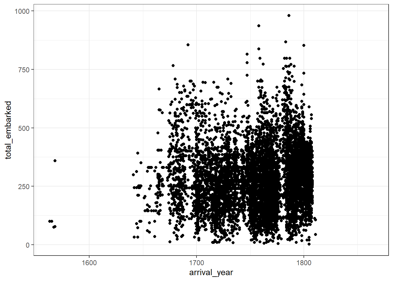
Figure 2.1: Basic scatterplot
There’s so many data points that it makes it difficult to get a real sense of the spread of the data. This isn’t a fault of the graph, it’s because of how many people were enslaved.
To help identify any trends, it can be useful to add a line of best fit with an additional layer and an additional geom. geom_smooth() uses the loess method by default but if you’re fitting a linear model it can be better to adjust the default to method = lm.
- Try both options and decide which one best represents the trend of the data.
ggplot(dat_final, aes(arrival_year, total_embarked)) +
geom_point() +
geom_smooth()
ggplot(dat_final, aes(arrival_year, total_embarked)) +
geom_point() +
geom_smooth(method = "lm")One final note on layers before we move on, the order of the layers matters. If you specify geom_smooth() first, ggplot() will take your orders literally and draw the data points on top of it.
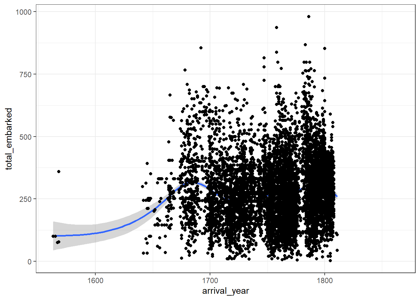
Figure 2.2: Badly ordered layers
2.6 Boxplots
Boxplots can be drawn using geom_boxplot() and require a categorical variable on the x-axis and a continuous variable on the y-axis.
- Run the below code. What’s the problem with this graph?
There’s too many categories of the x-axis to sensibly display on a single graph. We already know this from the output of summary, but we can use group_by(), count(), and arrange() to give us a total of how many data points there are for each port.
group_by()doesn’t make any surface changes to your data, instead, it groups the data so that whatever operation comes next is performed for each group in the specified variable.- Try removing the
group_by()line or changingstart_portto another categorical variable to see how the output changes. - This code uses
%>%or pipes. Pipes send the output of a line of code to the first argument of the next line of code and are an extremely efficient way to write code. There is more information in the Data Wrangling chapter.
port_counts <- dat_final %>% # take dat_final
  group_by(start_port) %>% # then group it by start_port
  count() %>% # then count how many observations in each group
  arrange(desc(n)) # then arrange it in descending order
Look at port_counts. As you can see, Liverpool, London, and Bristol have significantly more data points than any other location, so we will filter the dataset using filter() and just use these ports for the boxplot.
- This code uses the
%in%notation. You can read this as “retain any observation wherestart_portis equal to one of these values”.
Now we can run the boxplot again using the filtered dataset. We can see that the median number of slaves that embarked on each slave ship originating in Liverpool, London and Bristol was over 250 but that there are many cases where this number is much, much higher.
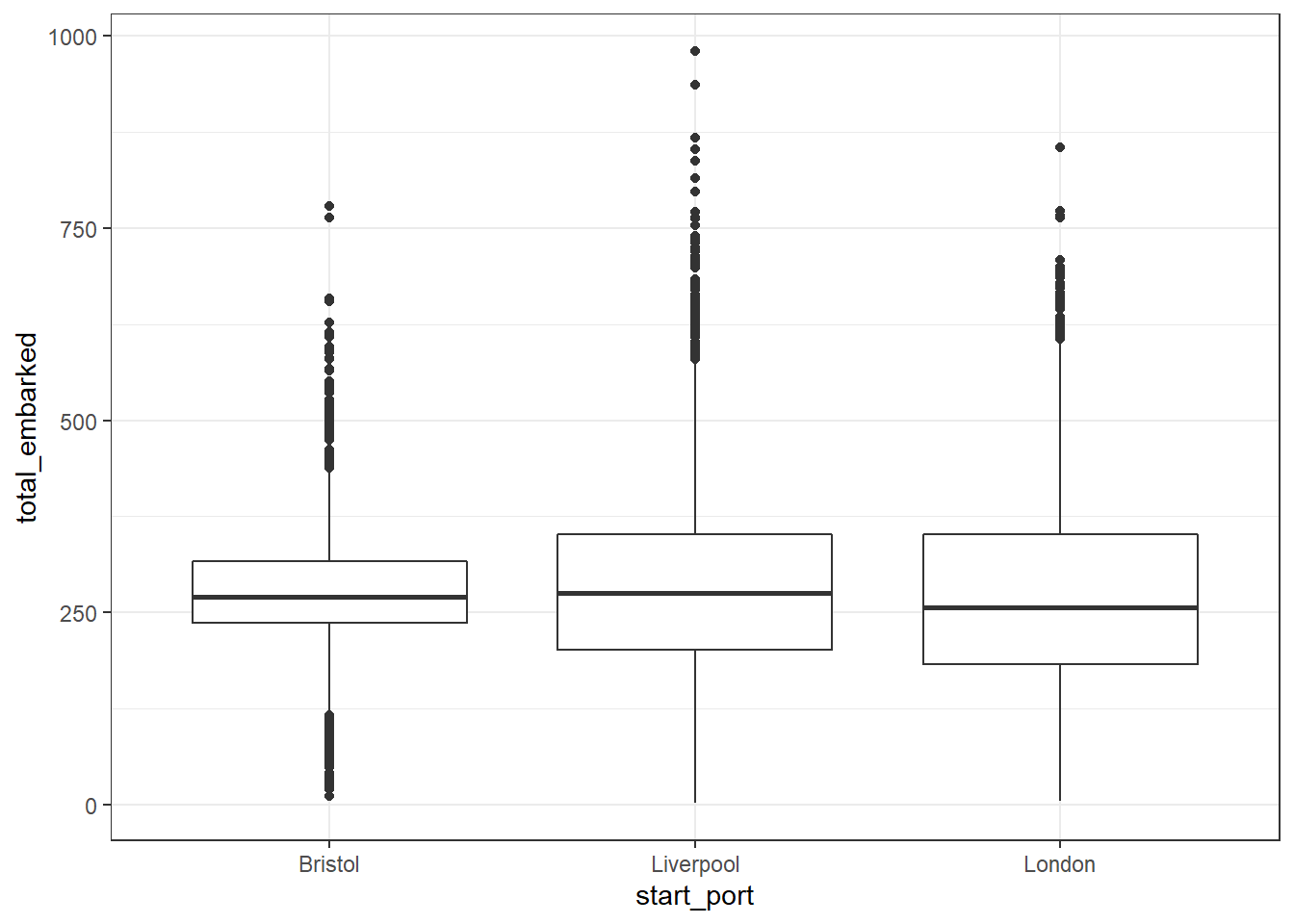
Figure 2.3: Simple boxplot
2.7 Violin-boxplots
R gives you a much greater range of visualisation options than those presented by proprietary software like SPSS or Excel. Using layers, you can add a violin plot on to a boxplot to show the distribution of the data using geom_violin()
Things to note:
- The order of the layers is important, if you draw the boxplot then the violin on top of it, you won’t be able to see the boxplot.
- Trying changing
trim = FALSEtoTRUE. - Try changing the value of
width = .2
ggplot(dat_filter, aes(x = start_port, y = total_embarked)) +
  geom_violin(trim = FALSE) +
  geom_boxplot(width = .2)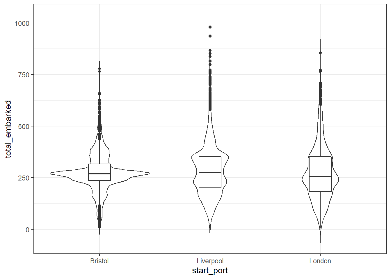
Figure 2.4: Violin-boxplot
We can see from these plots that the median number of slaves that embarked on each ship was just over 250 but that in many cases this number was much, much higher, particularly for ships that originated in Liverpool.
2.8 Bar charts
Bar charts should only ever be used to represent counts rather than measures of central tendency like the mean because they hide so much variability. Each geom has a default statistic associated with it (for example, the line in the boxplots above was the median) and in keeping with this ethos, the default statistic for geom_bar() is a simple count.
Things to note:
- With
geom_bar()you don’t need to specify the y-axis, because the y-axis is always going to be a count. - Try removing
fill = start_portand see what happens. - Try changing
show.legend()toTRUEand see what happens. Why do we want to suppress the legend in this case?
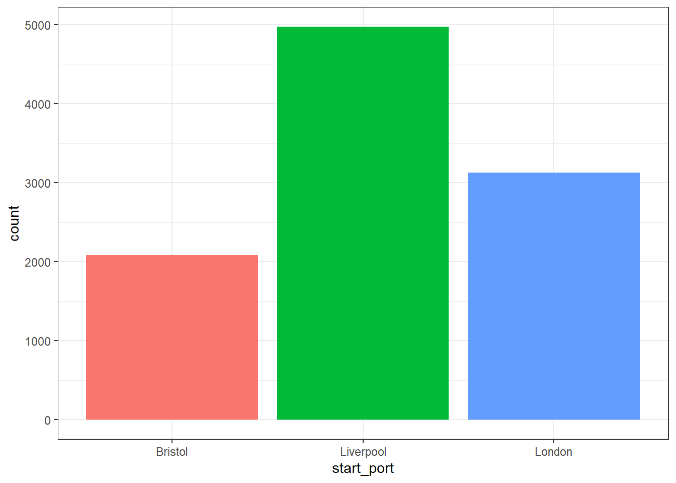
Figure 2.5: Bar chart of counts
Remember, this graph does not show the total number of slaves on the ships from these ports, it merely shows the number of voyages that originated from these three ports.
2.9 Plotting summary statistics
In the above plots, we have plotted the raw data. For the boxplots, R has done some calculations in the background to determine the medians and the IQR and the bar charts have counted the number of observations but we didn’t need to do anything extra. Often we will want to produce plots of summary statistics or aggregates.
To do this it is best to use summarise() to produce a summary table and then plot that data. We will follow on from the above and calculate the number of slaves, not just the number of voyages, that embarked on ships originating from these three British ports.
Things to note:
group_by()does the same as it did above. Try removing thegroup_by()line and running the code, what does it show instead?na.rm = TRUEmeans remove any NA (missing) values when calculating the summary statistic. If you don’t specify this and there are missing values, R won’t calculate your statistic. Sometimes this is what you want, sometimes it isn’t.
port_summary <- dat_filter %>%
  group_by(start_port) %>%
  summarise(embarked = sum(total_embarked, na.rm = TRUE))
Look at port_summary. How many slaves embarked on slave ships that originated in Liverpool?
We can then use this summarised data to create another bar chart, however, this time, because we don’t need R to count up the values (we’ve already done it), we’re going to use geom_col() rather than geom_bar(). The default stat for geom_col() is “identity”, i.e., it just uses the exact numbers you give it rather than calculating anything.
Things to note:
- We now have to specify the y-axis, to tell
geom_col()which column of numbers we want to represent on our plot. - We’ve added an extra layer that makes our fill colours colour-blind friendly (the viridis palette). Because our fill variable is discrete (categorical), we’ve used the
...viridis_doption, if we had a continuous variable, there’s a...viridis_cversion. - Try changing
option = "E"to any letter from A - D and see which one you prefer.
ggplot(port_summary, aes(x = start_port, y = embarked, fill = start_port)) +
  geom_col(show.legend = FALSE) +
scale_fill_viridis_d(option = "E") 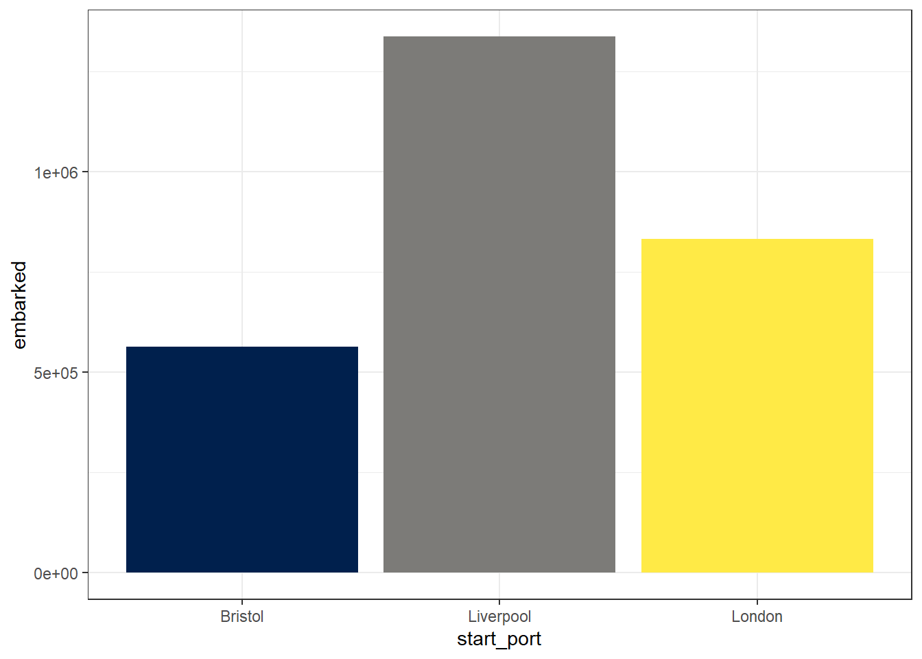
Figure 2.6: Bar chart of summarised data with colour-blind palette
There were so many slaves embarked on ships originating from these three ports that R has decided that it is better to use scientific notation for the y-axis values. Try and think about the last time you had any data where the numbers involved were this large.
To override this behaviour and make the plot more readable we need to add an extra argument to adjust the y-axis labels.
ggplot(port_summary, aes(x = start_port, y = embarked, fill = start_port)) +
  geom_col(show.legend = FALSE) +
  scale_fill_viridis_d(option = "E") +
  scale_y_continuous(labels = scales::comma)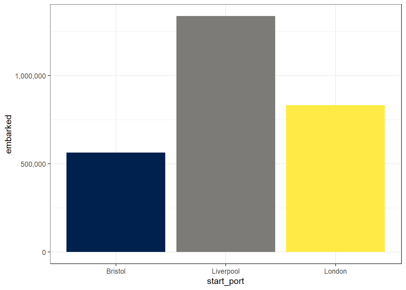
Figure 2.7: Bar chart with adjusted y-axis labels
Let’s make some further visual adjustments:
labs()controls the labels of the axes.- You can adjust the overall theme of the graph using the theme functions. Here I have used
theme_minimal()but there are lots of others available. Try deleting the line of code and then typetheme_and see all of the options that come up on the auto-complete suggestions. Try them out to find one you like.
ggplot(port_summary, aes(x = start_port, y = embarked, fill = start_port)) +
  geom_col(show.legend = FALSE) +
  scale_fill_viridis_d(option = "E") +
  scale_y_continuous(labels = scales::comma) +
  labs(x = "Port ship originated from",
       y = "Number of slaves embarked",
       title = "Slaves embarked on ships originating in British ports") +
  theme_minimal()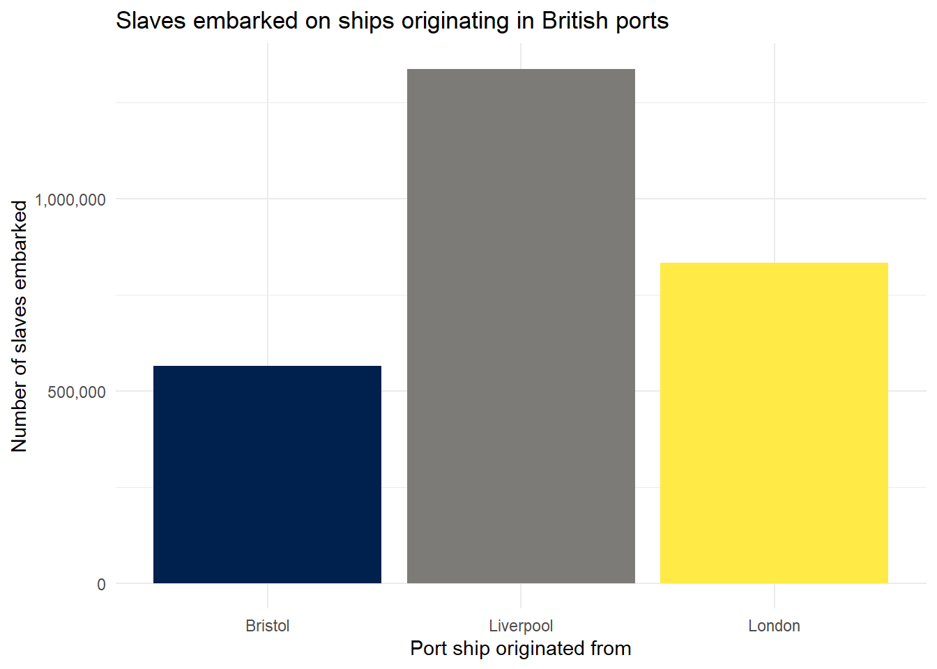
Figure 2.8: Bar chart with theme and title
2.10 Saving plots
The ggsave() function makes it easy to save your plots. By default, R will save your plots to the main folder of your working directory unless you tell it otherwise.
The only argument you must provide to ggsave() is the name of the file you wish to create, with an image file extension. You can choose to save your image as “eps”, “ps”, “tex” (pictex), “pdf”, “jpeg”, “tiff”, “png”, “bmp”, “svg” or “wmf”.
If you only provide the file name, R will save the last plot you created.
## Saving 7 x 5 in imageIf you want to make sure you save a specific plot, you can save your plot to an object and then give that argument to ggsave().
my_plot <- ggplot(dat_filter, aes(x = start_port, fill = start_port)) +
  geom_bar(show.legend = FALSE)

ggsave(filename = "my_plot.jpeg", plot = my_plot)
## Saving 7 x 5 in image2.11 Adding more variables
So far all the plots we have made have represented a maximum of two variables, however, often you will want to represent three or more variables (be they continuous or discrete) and there are two main ways that you can do this. The first way is to display data from all variables on the same plot broken down by groups.
First let’s make another standard scatterplot, this time looking at how many slaves died in each year.
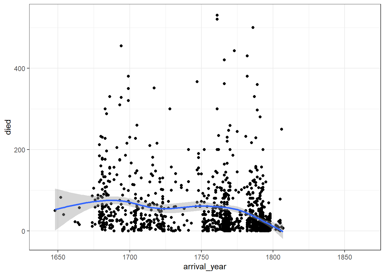
Figure 2.9: Two-variable scatterplot
We can break this down by port of origin using colour.
ggplot(dat_filter, aes(arrival_year, died, colour = start_port)) +
  geom_point() +
  geom_smooth(aes(colour = start_port)) +
  scale_colour_viridis_d(alpha = .8, option = "D")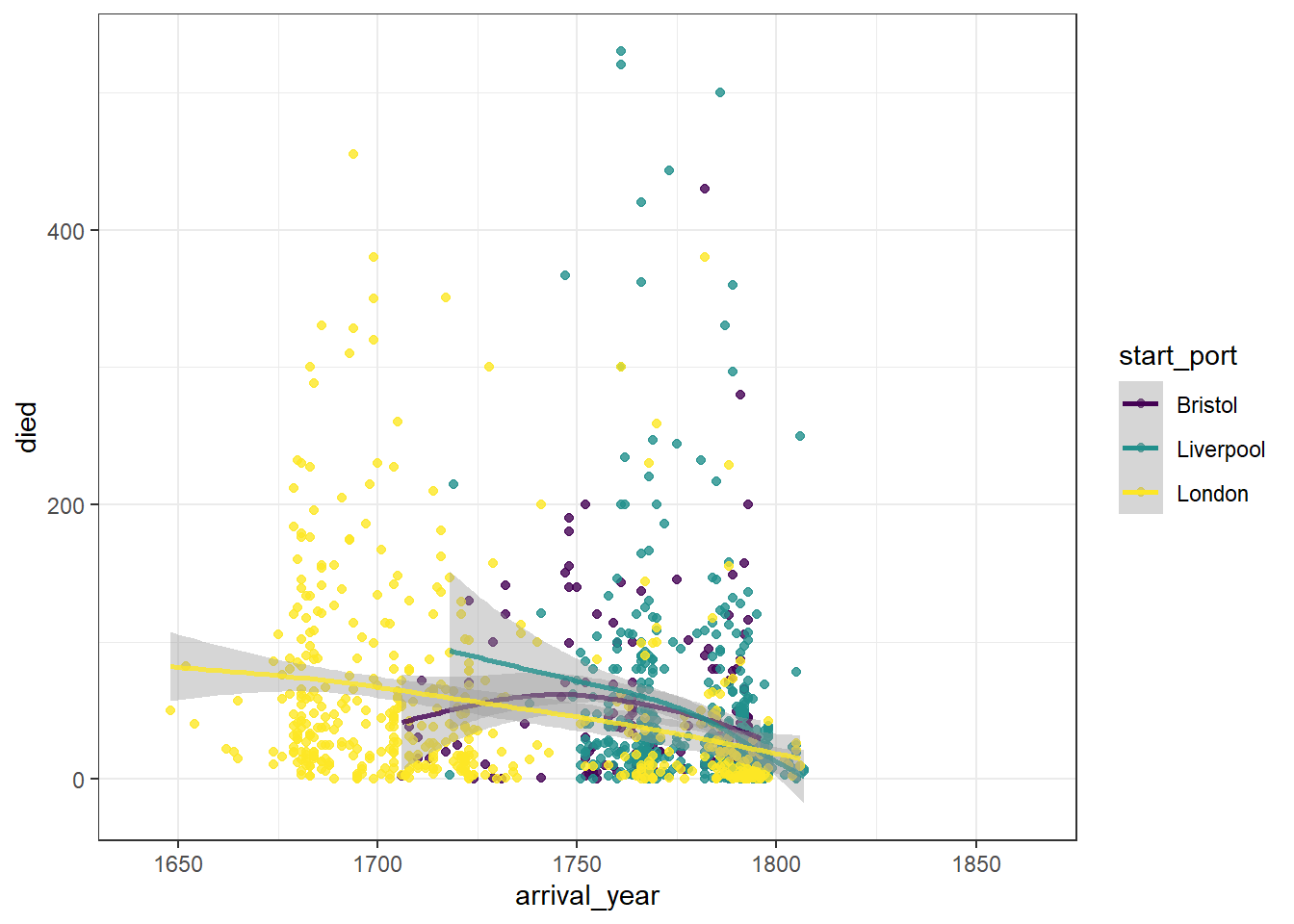
Figure 2.10: Scatterplot grouped by colour
This graph now shows the data points and line of best fit in a different colour for each port of origin. We can make this easier to read by adding a theme, editing the axis labels, and also adjusting the limits of the x-axis so that there is no wasted space.
ggplot(dat_filter, aes(arrival_year, died, colour = start_port)) +
  geom_point() +
  geom_smooth() +
  scale_colour_viridis_d(alpha = .8, option = "D") +
  theme_minimal() +
  labs(x = "Year of arrival",
       y = "Number of slaves who died",
       colour = "Port of origin") +
  scale_x_continuous(limits = c(1641, 1815))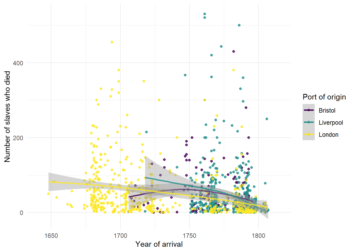
Figure 2.11: Grouped scatterplot with adjusted axes
Alternatively, we can create three separate plots for each port using facet_wrap().
The base code for this plot is similar to the above with the following changes:
start_portis removed from the first line of code specifying the aesthetic and instead is added just togeom_point()so that only the data points have different colours, not the line of best fit, to make it easier to read (try adding it back in to the first line and see what happens).- An extra layer of
facet_wrap()is added that tells R to split the graphs for each level ofstart_port. nrowspecifies the number of rows the plots should be split across. Try changing this number to 1.
ggplot(dat_filter, aes(arrival_year, died)) +
  geom_point(aes(colour = start_port), show.legend = FALSE) +
  geom_smooth() +
  scale_colour_viridis_d(alpha = .8, option = "D") +
  facet_wrap(~ start_port, nrow = 3) +
  theme_minimal()+
  labs(x = "Year of arrival",
       y = "Number of slaves embarked",
       title = "Slave deaths for ships with British ports of origin") +
  scale_x_continuous(limits = c(1641, 1815))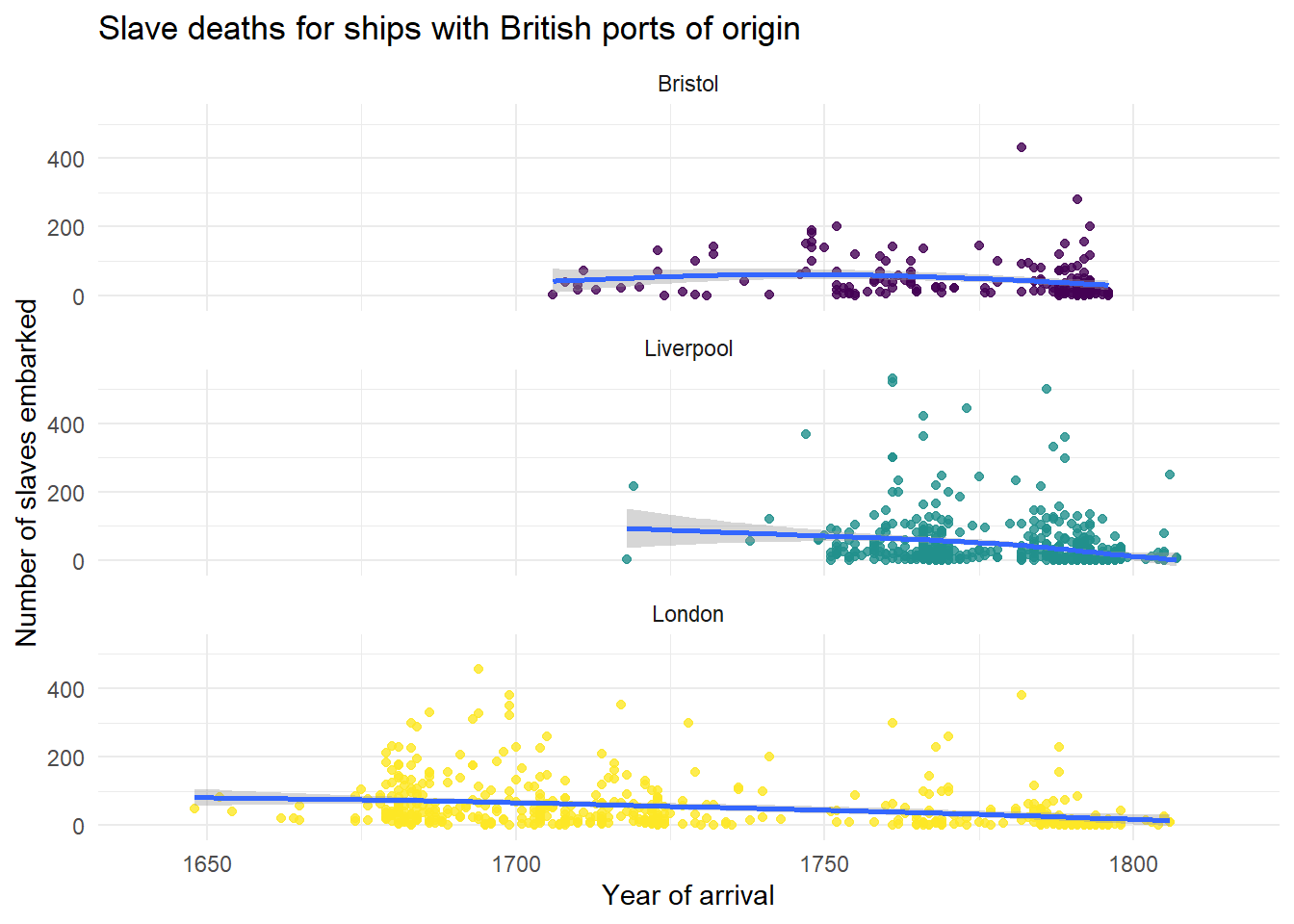
Figure 2.12: Facetted scatterplot
2.12 Reshaping data
For our final plots, we need to reshape the data before we can use it. We want a plot that shows the proportion of men, women, and children on ships originating from the three British ports.
The function pivot_longer() is used to transform data from wide-form into long-form. If you’d like more detail on this, see Data Wrangling 3.
When it comes to reshaping data it is easier to show than tell - run the below code then look at dat_long and see how the columns that used to contain the information about the proportion of women, men, and children on each ship have changed.
dat_long <- dat_filter %>%
  pivot_longer(cols = c("women", "men", "children"),
               names_to = "slave",
               values_to = "prop")
We can now use the variable slave (woman, man, child) as a categorical variable and plot the average proportion of slaves who were men, women, and children combined with other variables.
2.13 Grouping data with fill
Above we displayed different colours of a scatterplot by specifying a continious variable to colour. We can do the same for categorical variables using fill. In the below plot we can represent the proportion of women, men, and children on ships originating from the three British ports, that is, we are representing one continuous variable (prop), and two categorical variables (port and type).
- Add the code that edits the axis labels. You should change the labels for x, y and fill, and also add a title.
- Change the value of
alphaand see what happens.
ggplot(dat_long, aes(x = slave, y = prop, fill = start_port)) +
  geom_boxplot(alpha = .5) +
  scale_fill_viridis_d(option = "E") +
  theme_minimal()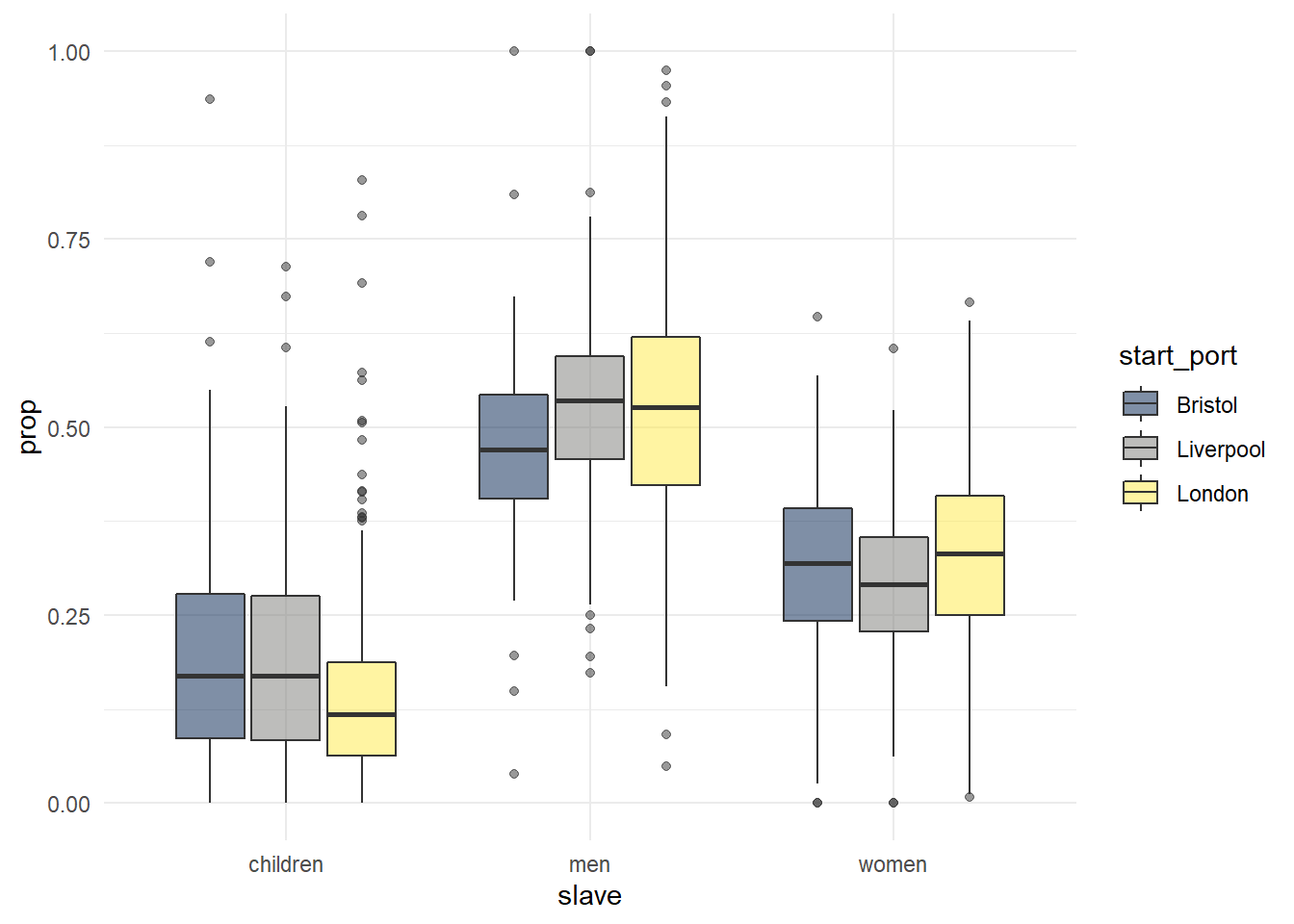
Figure 2.13: Grouped boxplot
Finally, we can combine ggplot() with filter() using a pipe to narrow down our dataset without creating a separate object.
- Use
fillto give each boxplot a different colour. - Suppress the legend for
geom_boxplot()because it’s not informative - Use the
viridispalette
dat_long %>%
  filter(outcome == "Slaves disembarked in Americas") %>%
  ggplot(aes(x = slave, y = prop)) +
  geom_boxplot() +
  scale_fill_viridis_d(option = "E") +
  theme_minimal() +
  labs(title = "Proportion of women, men, and child slaves \n on ships disembarking in the Americas")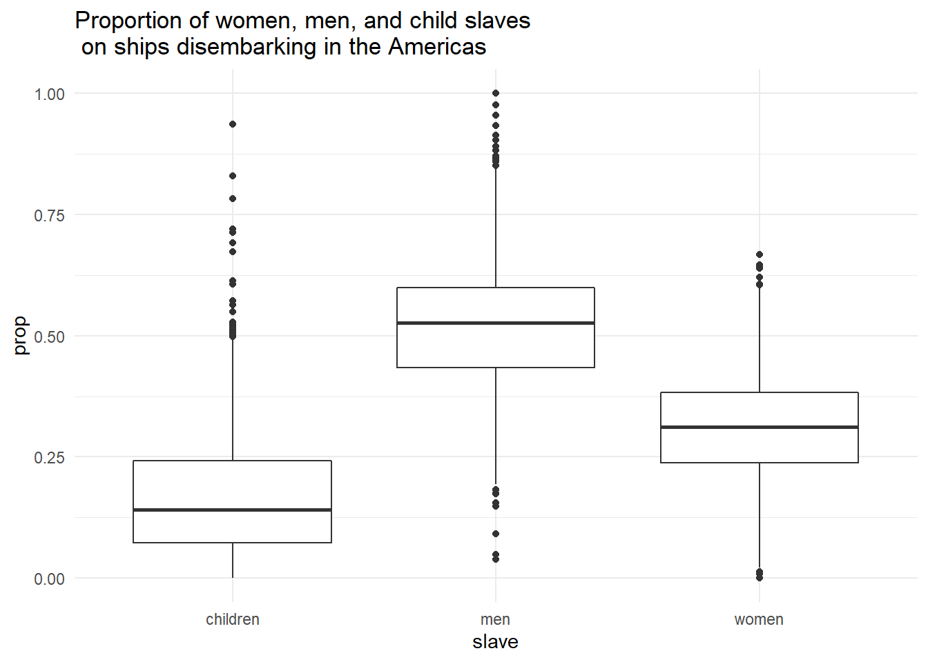
Figure 2.14: Boxplot using filtered dataset